Tabule | Midtown
Restaurant Interior Design, Toronto
Designing Tabule’s original location in Toronto.
Interpretation of traditional Middle Eastern food with a modern twist.
The Tabule Family of Restaurants is made up of 4 uniquely designed venues specializing in Middle Eastern Cuisine. Sansa Interiors was tasked with tackling the redesign of the quartet’s flagship location in Midtown, Toronto.
City: Toronto
Property Size: 2,400 sf
Timeline: 10 Months
Budget: $750,000
When the client approached Sansa Interiors to tackle the redesign of their Tabule Midtown location, they knew they wanted something brighter, airier and fresher. The Midtown location was their first restaurant, and it was in need of an aesthetic overhaul.
Using the design of the other three locations as a jumping off point, Sansa Interiors founder Jude Kamal worked closely with the clients to convey their vision, delivering a cohesive new design that reinvigorates the restaurant. The focal point? An impressive new bar to anchor the design and invite guests into the bustling dining room.
The goal for Tabule Midtown’s restaurant interior design was to create a modern and sophisticated atmosphere where their delicious dishes could play a well-deserved starring role. Jude shares her approach to bringing the project to life below.
Before and After
From an outdated space
To an open and fresh cuisine
The Design Approach
Restaurant Interior Design
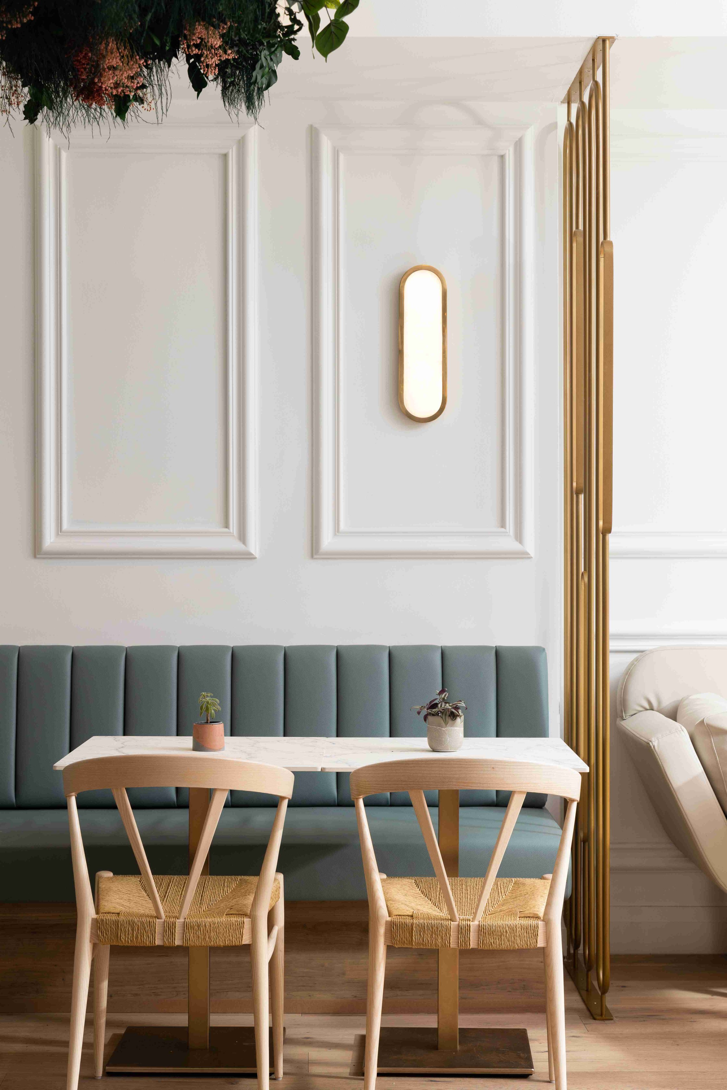
Our design approach for Tabule Midtown was to create a modern and sophisticated space that is evocative of traditional Middle Eastern and Lebanese aesthetic without being too literal. To accomplish this, we opted to avoid overusing traditional Mediterranean shapes in favour of more modern interpretations of the colour palette, materials and overall vibe of the space.
We also made the decision to start by defining a palette of colours and finishes as inspiration, which helped to give us a better sense of the restaurant’s potential. We landed on a palette of neutral tones and natural materials, with a hint of pattern, to give the space the cohesive look that the client was after. We all fell in love with a serene combination of greens, blues and neutral tones – with plenty of greenery mixed in - to give life and texture to the newly designed interior.
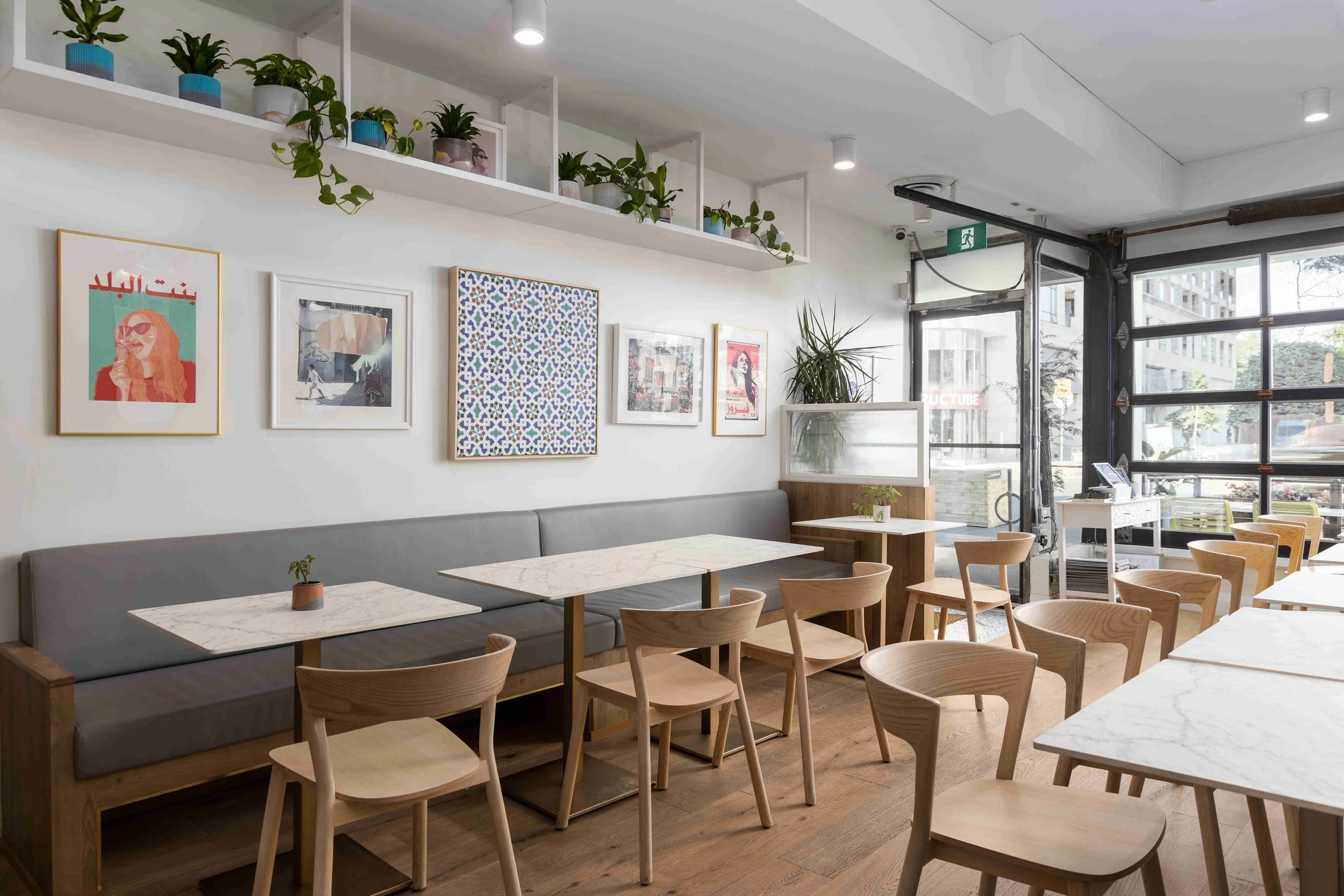
The focus behind the restaurant’s interior revolves around sourcing local materials, items and artwork from BIPOC female run businesses in Toronto & GTA. Tabule's style is a balance between our clients' brand which is a hip Lebanese restaurant with good food, plus Sansa Interiors’ interpretation of what it could be. We wanted the space to feel very bright and airy, as if you are sitting in a lovely breezy courtyard in Beirut.
Middle-Eastern food is all about gathering, sharing, and spending time with people you love and care about, so we took this as a way to make the space work from day-night and for any occasion, any gathering and any family or couple looking for a beautiful space and tasty food.
Mood Board
Mood Board
Sansa Interiors’ mood board for Tabule Restaurant bringing in a subdued earthy, light and airy palette.
The Concept
While developing the concept for this restaurant, we really took inspiration from the food. We immediately envisioned the dishes boldly standing out on the plate, surrounded by a simple, elegant and sophisticated design. Putting the food at the forefront and creating an area where people could sit back and enjoy it, was the true driving force behind the new Tabule.
We executed this vision by striking a fine balance between bold and vibrant elements and upscale elegance, suitable for Midtown Toronto. We also took a cue from the restaurant staff, who are artsy, cool and unique. While imagining where we could push the design, we took inspiration from their effortless style.
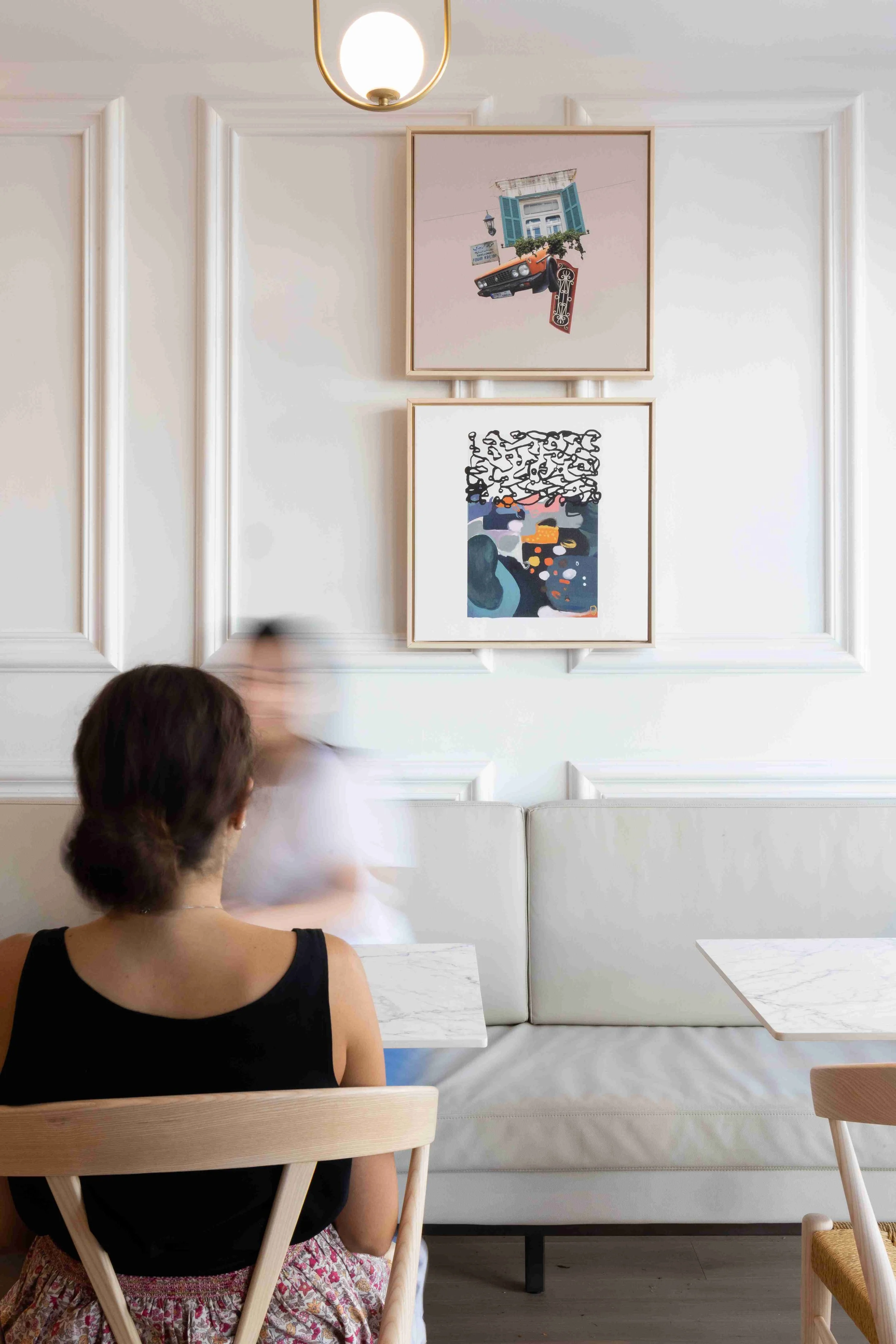
We also learned so much about Lebanon from this project. The country has a very distinct style of vintage pop art, landscape paintings and textile crafts that really spoke to us. Through their art, you can feel how proud Lebanese people are of their country and the colours they use are really inspiring. We incorporated Fairuz (who is a lebanese singer) into a large piece of art that’s hanging on the wall, with her music playing in the background. To give you a taste of culture through art, music and the overall ambience of the space.
These thoughtful touches help the design feel more connected to its purpose, and make it feel authentic. It’s those little moments that help tie the design back to the culture, but in a fresh and exciting way.
The Blueprints
Surrounding it, we maximized seating throughout, eliminating the tight corners that existed in the previous layout and opting instead for more spacious tables and chairs. The two sides of the restaurant were connected in a more cohesive way – both through the floor plan, ensuring proper flow, as well as with finish materials and décor.
We maintained separation between the kitchen and dining room to reduce noise from the kitchen, and we used the ceiling to our advantage by installing acoustic panels to help dampen sound. We also opted for softer finishes and an impressive hanging garden to help further absorb sound. We played with lighting by adding layers and creating adjustable zones on dimming switches to give the staff full control of the atmosphere.
We also tackled the exterior of the restaurant, as well. Outside, there was more of an opportunity to play with colour, which we did in the restaurant’s logo and exterior furniture. When Tabule was approved to join CafeTO, we maximized the outdoor seating and designed a comfortable space for guests to dine.
One particularly unique aspect of Tabule’s floor plan was the need for a designated area to receive and fulfill online orders. We learned that each delivery app requires its own tablet screen to function, so we created a purpose-built space to streamline Tabule’s takeout business.
The Build
Overall, the build of this project went incredibly well. We once again worked with Build it By Design, whose work and craftsmanship we really admire. Their work is always impeccable and they’re incredibly communicative from start to finish, which makes them wonderful partners.
This site was also easy to work with because of its access to a private laneway. A large receiving door at the back of the restaurant made accepting materials and appliances a breeze.
With the exception of the final furniture and décor pieces, construction took approximately twelve weeks to complete, which made us, our clients - and the restaurant patrons - very happy.
The Final Results
The final result of Tabule Midtown’s redesign is a sophisticated and modern space that brings out the spirit of Lebanese food in a simple and elegant way. We couldn’t be more proud – or ready to dig in for a delicious bite!
The Challenges
Arguably, the most important aspect of any restaurant interior design is the guests’ experience. At Tabule Midtown, this important consideration remained front and centre throughout the design process. From the first vignette that guests experience upon entering the restaurant, to the way they move through the space, to the acoustics and hint of view into the kitchen, each experience was choreographed through design.
As an experienced restaurant interior design studio, we’re skilled at putting clients’ needs front and centre, which means tackling the challenges we faced during the design and construction of Tabule Midtown was nothing we couldn’t handle!
Balancing the Budget
The biggest challenge our team faced during the redesign of Tabule’s Midtown location was the budget. The initial budget for the redesign was ambitious for a renovation of this size and, while we knew it was doable, we did need to get creative.
We started off by working closely with our clients to decide which design elements were non-negotiable, and where we had wiggle room to reallocate budget elsewhere. i
We had also originally envisioned filling the space with original art from local artists, but we quickly realized that the budget simply wouldn’t allow it. Instead, we chose to source interesting prints by artists and unique locally sourced pieces to add that eclectic aesthetic we were looking for.
We were also able to source some attractive ready-made décor and accents, including the tables, chairs and lighting versus creating custom-made pieces. It took us a little more time to find the perfect pieces, but it was so worth it in the end – both from an aesthetic and budget perspective.
Optimized Layout
Reconfiguring the space was a major priority of this project. The restaurant is actually two separate units, which had been awkwardly connected by small openings between the buildings.
To accomplish this reconfiguration, we gutted the whole kitchen at the back of the restaurant and focused on increasing the feeling of openness throughout the space. We maximized the number of seats the restaurant could hold by installing an impressive bench along one wall.
While we knew creating a functional layout that was efficient for staff and provided guests with a good experience was possible, we did run into some limitations. Because the unit is two buildings, there were fire separation requirements that needed to remain, and we were limited in the areas we could run new mechanical and electrical.
The team got creative with the placement of services to avoid interfering with the aesthetic, or the customer experience, and was able to settle on a functional floor plan that exceeded expectations
Lead Times & Delays
Unexpected delays were a major challenge for this project. Despite ordering key design elements with plenty of lead time, delivery timelines continued to get pushed farther and farther back. Our furniture, which we had originally expected within just a couple of months, took over eight months to arrive, as did the feature stone for the bar.
Waiting for the final pieces to arrive was a huge challenge. I was in near constant contact with my suppliers, pushing for updates and urging for more timely delivery of products. In the end, we had to find creative ways to get the project close enough to completion that the restaurant could open its doors.
Our table and chair supplier delivered temporary furniture for us to fill the space, and my millworker installed a temporary piece of marble-patterned laminate to the face of the bar while we waited for the slab to arrive. The restaurant opened successfully, and we all celebrated when the real piece of stone was finally installed!
Team of Consultants & Local Partners:
Interior Design & Permitting: Sansa Interiors Inc.
Construction and Build: Build It By Design
Millwork: Canara Woodworking
Plant Canopy: The Indoor Forest
Real Plants: Black Canary
Handmade Cement Pots: Sunset Cement
Artwork: Emily Snyder, Our founder Jude in collaboration of a mix of artists.
Photography: Bruno Belli
Feeling Inspired?
If you're in Mid-Town Toronto and looking for a full restaurant interior design, we'd love to collaborate.
Contact us and let our team of interior designers support you.
Sansa Interiors Inc.
Toronto, Canada
info@sansainteriors.com
(647) 556-3137


