Mean Bao
Fast Food Restaurant, Toronto
Fusion of aesthetics and functionality at Bay Adelaide Centre
As a street-style Chinese fast-food restaurant chain with more than three branches, Mean Bao has once again enlisted the expertise of Sansa Interiors, this time to revamp its Bay Adelaide branch after using our services for designing its other locations previously. Mean Bao offers take-out and grab-and-go settings and is determined to enhance operational speed and efficiency while remaining loyal to its distinct brand identity. This Mean Bao location comes with a bit of a twist that differentiates it from it’s other locations and that is the live steaming process for their baos and dumplings.
City: Toronto (Bay Adelaide Centre)
Property Size: 495 sf
Timeline: 8 Months
Budget: $350,000


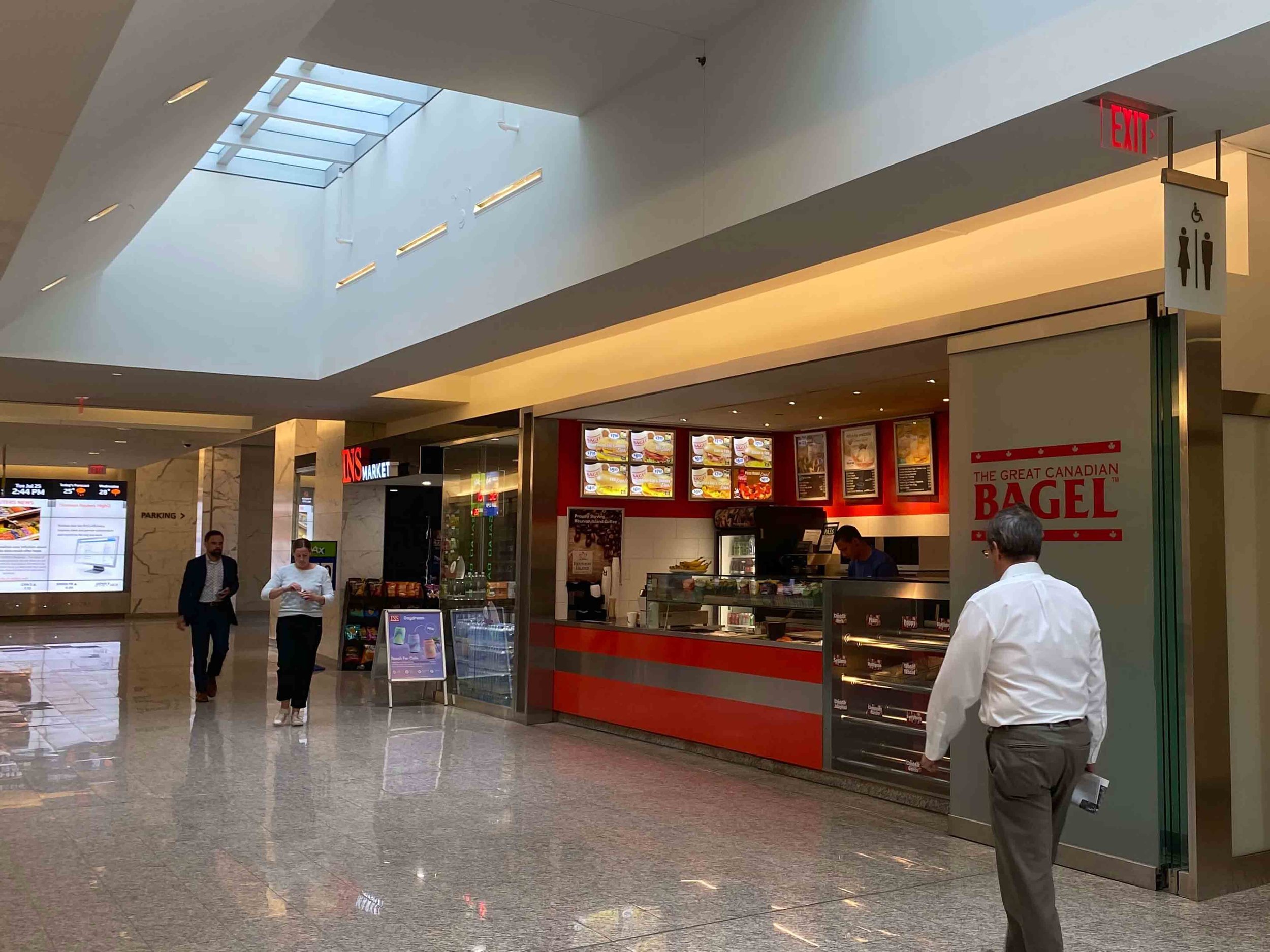
Before and After
From an outdated space
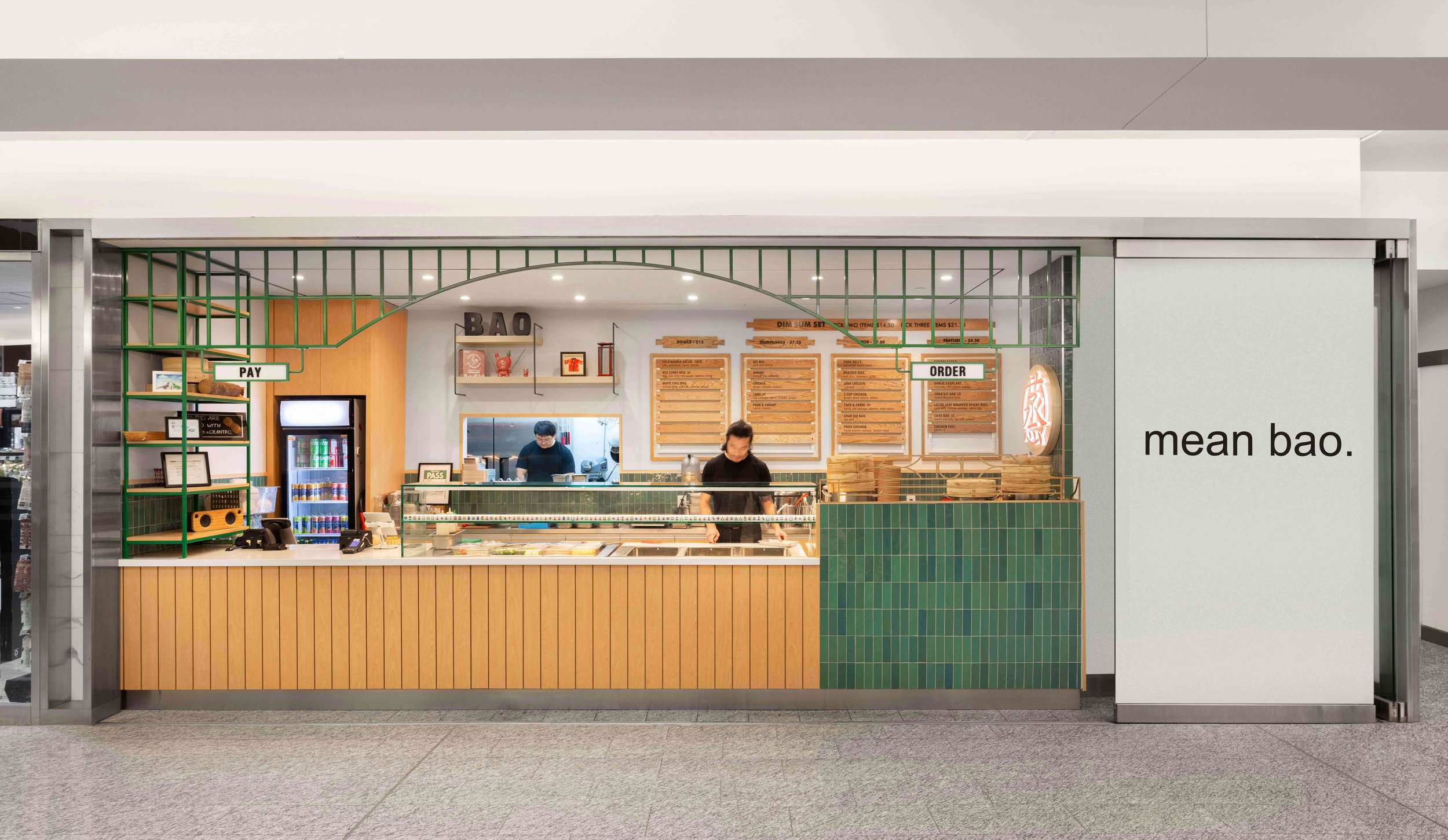
To an energetic, earthy and airy flow
Elevating Brand Presence for Fast Food Restaurant Recognition
Our motto was to transform the fast-food restaurant experience into something new, different, and extraordinary. We designed Mean Bao to revolutionize the QSR (Quick Service Restaurant) landscape. As a client, Mean Bao approached us without preconceived notions, entrusting us to craft an unparalleled experience for them. Embracing their vision, we aimed to establish welcoming locations catering to the increasing demand for takeout and grab-and-go meals. To maintain a consistent brand identity across all its venues, we strived to ensure that each location’s style and operations reflect its original vision.
Mean Bao’s ultimate aim was to delight customers with delicious, mess-free cuisine, providing a distinctive Asian fusion experience. Recognizing this goal, Sansa Interiors endeavoured to blend traditional designs with contemporary trends to embrace cultural values. With a diverse clientele in mind, the restaurants should offer a contemporary take on eclectic Asian fusion elements while still being familiar and innovative.
Operations
Besides offering super delicious food, Mean Bao prioritizes efficiency and convenience as well. They wanted to create a space that could make day-to-day procedures easy for their employees and customers. These steps not only make the ordering process easier and reduce wait times but also create a pleasant environment that encourages return visits. By implementing strategic measures, such as intuitive ordering systems and thoughtful spatial planning, Sansa Interiors translated its vision into reality.
The Design Approach
Our design strategy for Mean Bao was comprehensive, aiming not only to create a modern fast-food restaurant interior but also to seamlessly blend operational efficiency with visually captivating design elements. To achieve this, we integrated principles of design psychology into the restaurant architecture, recognizing their profound impact on the overall dining experience.
We understand that factors such as layout, colour scheme, lighting, and choice of materials could evoke specific emotions and influence customer behaviour. With this in mind, Sansa Interiors strategically positioned service areas and implemented intuitive navigation pathways to optimize workflow efficiency. This approach ensured smooth operations while maintaining visual appeal and enhancing the overall dining experience.
We also focused on bringing in a Chinese Street-Food style and appeal to this location by layering materials and placing the live steaming of baos and dumplings at the forefront. You will be able to smell the fresh food being cooked as you pass by and that is quite unique these days with everything being pre-prepared.
Mean Bao’s Design Narrative
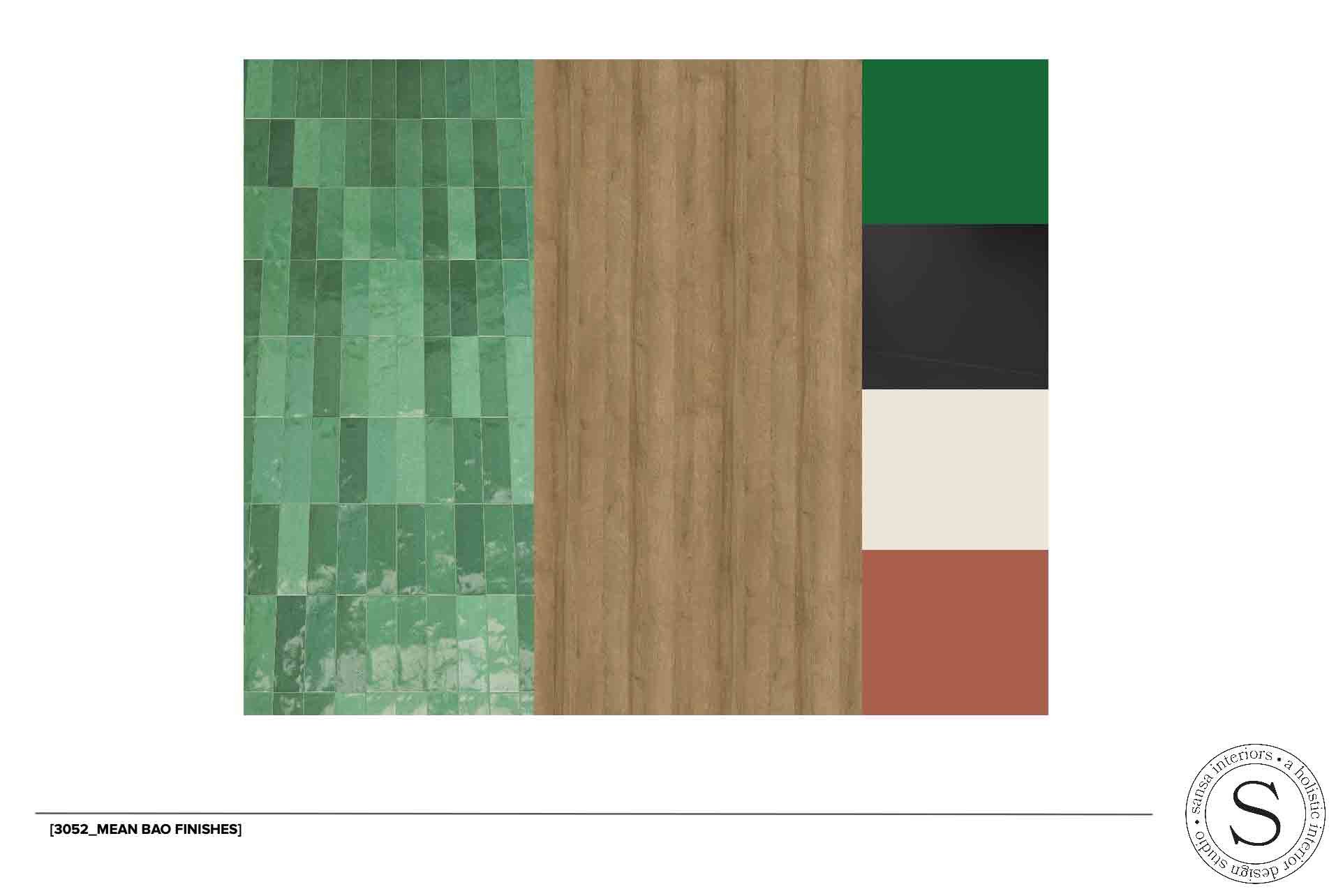
The Mean Bao design narrative was all about seamlessly blending bold colours with Chinese characters, honouring the rich heritage and roots of Mean Bao’s cuisine, deeply rooted in Dim Sum-inspired foods. To create a space that not only reflects the essence of Mean Bao’s culinary offerings but also resonates with its cultural origins, we had to adjust some colour combinations for the front countertop and backside of the counter.
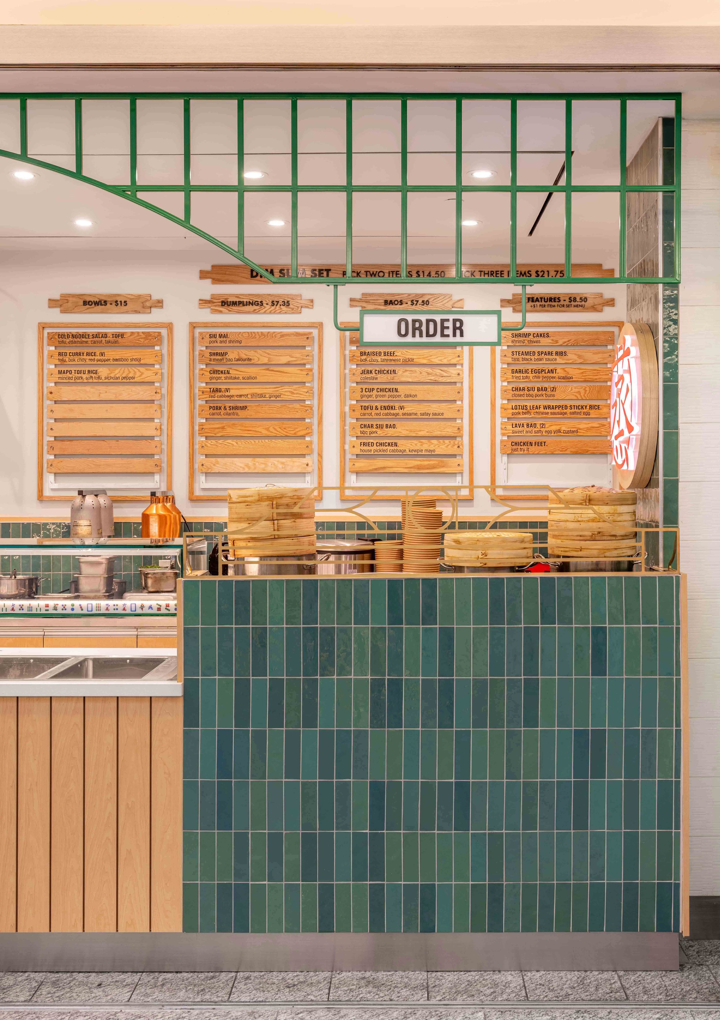
We crafted a striking brown wall adorned in a palette of green hues, accentuated by the timeless allure of traditional bamboo wood. By harmonizing these colors with the natural texture of bamboo, we achieved a seamless fusion that exuded a sense of unity and coherence throughout the space.
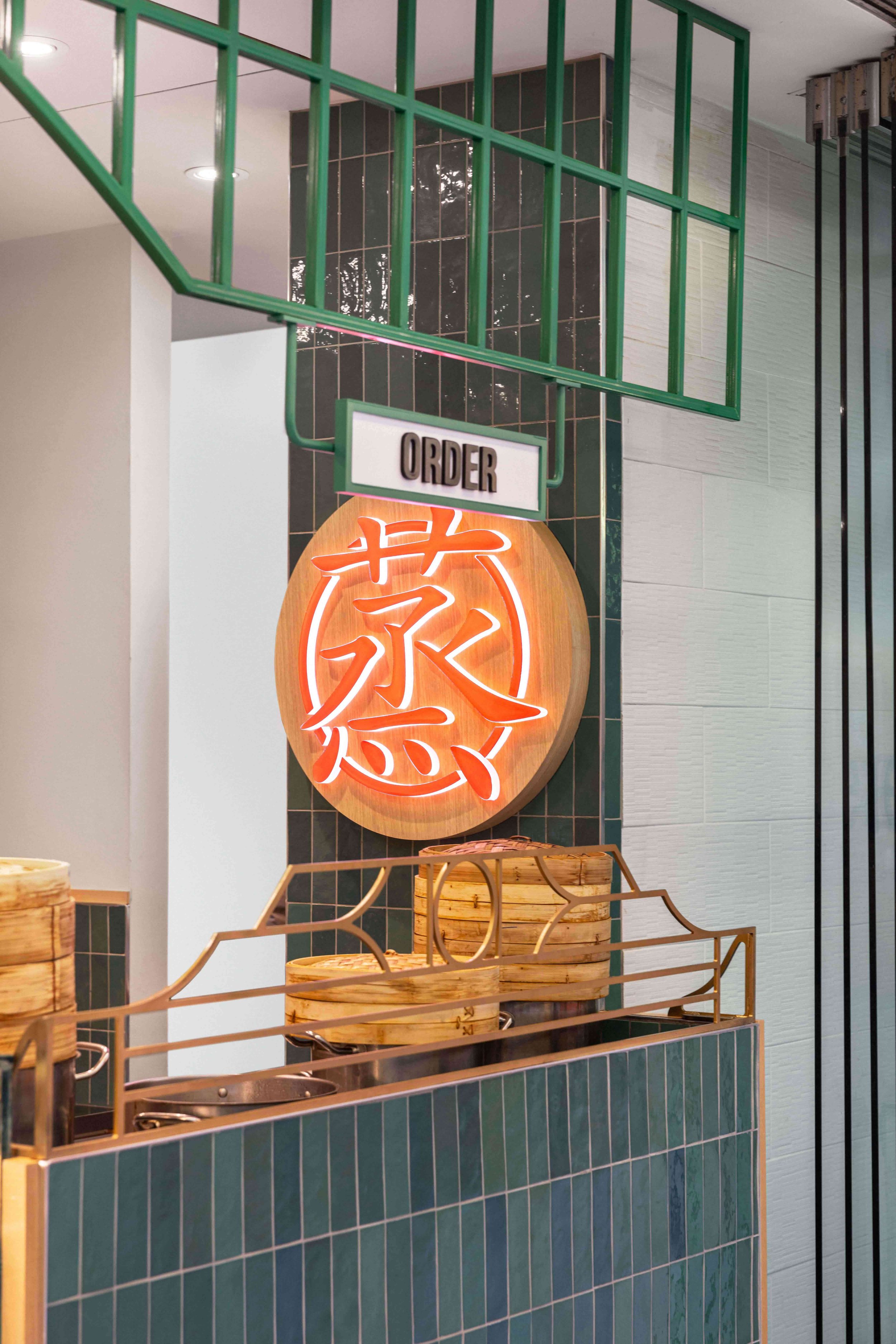
To add depth to the design, we opted for a rough, earthy concrete and green surface for the countertop front wall. The vibrant red neon sign on the side wall served as a focal point, infusing the space with energy and allure while simultaneously amplifying Mean Bao’s brand identity.
Architectural Plans
Before beginning the project, we needed approval for the blueprint of Mean Bao’s location inside the Bay Adelaide complex. This approval ensured that our project met the highest standards of quality and safety. The project’s scope and location also required us to follow specific guidelines for architectural blueprints, renderings, and materials.
The total budget for the Mean Bao Bay Adelaide branch was $350K, and we carefully allocated funds to ensure optimal utilization. To make the restaurant stand out, we designed a prominent back wall that serves as the focal point. This wall also has a functional aspect facilitating seamless order reception and delivery through a strategically placed window. The menus were mounted symmetrically above eye level, making them more accessible and visually appealing.
The storefront boasted a glass door adorned with the striking black Mean Bao logo, welcoming customers with a touch of sophistication. The front counter wall was designed with a mix of brown wood and green hues, creating a dynamic and inviting atmosphere.
Our takeout-only restaurant’s simple features played a crucial role in improving functionality and flow. It blends aesthetics and functionality, making the most of the space while quickly serving customers.
Project Execution
Mean Bao is a restaurant in a bustling corridor of the Bay Adelaide Complex. To catch people’s attention, we created an elegant and captivating storefront. We also decorated the space with plants and other adornments to improve its impression. Along the back wall, shelves were adorned with plants and a BAO solid wood logo, seamlessly complementing the overall aesthetics.
The restaurant’s design incorporates a practical and visually appealing pass-through window to transfer food from the kitchen to the front. We utilized suspended clipboard menus to assist customers in choosing their orders. This may seem like a small detail, but it helps the restaurant function smoothly. We aimed to ensure that the restaurant had an excellent appearance and efficiency.
Brand Consistency
The concept for this particular Mean Bao is different than the typical Mean Bao brand standards as this location is unique and provides different dishes and a more boutique experience. Sansa Interiors approached this aspect of the design with an approach that still makes this location stand out but carry through similar brand elements to keep it recognizable. Ensuring that every element reflected the essence of Mean Bao’s Asian fusion cuisine and brand philosophy. From the colour scheme and materials used in the design to the signage and graphic elements, every design decision was carefully selected to evoke the spirit of Mean Bao. Whether customers visit one location or all three, they will experience a unified and immersive environment that resonates with Mean Bao’s unique culinary journey.
The Challenges
There are always challenges when it comes to an interior design project, and no matter how well you plan ahead, they will always come up out of the blue.
We anticipated some of these challenges due to previous experience and as a restaurant design company, we know that there will always be unexpected challenges when it comes to interior design for restaurants. In our industry, you should always expect the unexpected.
We were prepared in advance and warned the client and contractor in order to be ready to take on whatever obstacles that would emerge during this design project. We faced three main challenges, all of which we tackled with properly coordinating with our suppliers, the general contractor and the client.
Limited Space
The compact size of the Mean Bao Bay Adelaide venue presented a challenge, requiring creative solutions to utilize every inch of space. Sansa Interiors tackled this challenge by using strategic space-saving techniques, such as maximizing vertical storage and implementing efficient layout designs. By carefully planning the placement of equipment and service areas, we created a sense of spaciousness despite the limited square footage.
Operational Efficiency
Mean Bao had a high demand for takeout orders from two of its locations, which made operational efficiency a top priority. To address this challenge, Sansa Interiors analyzed the workflow of each venue, identified bottlenecks, and implemented solutions to streamline operations. We strategically located order stations and food preparation areas for better efficiency. Along with that, we integrated digital ordering systems and automated equipment to optimize the layout. By streamlining every step of the process, from order placement to pick up, we ensured Mean Bao could meet customer demands promptly and seamlessly. This, in turn, enhanced overall satisfaction and loyalty among customers.
Off-Hours Access
Since Bay Adelaide Plaza is located in the underground path in downtown Toronto, it was a challenge to coordinate deliveries and get materials in off-hours. In addition, due to the limitation in hours of work provided to contractors, it was tedious for our contractors to be able to finish the work within the window provided. However, this didn’t deter us and we managed to work with the contractor to keep the project on track, they worked overnight and were able to quickly get into a rhythm and system for transporting materials and getting the job done in a timely manner.
Project Outcomes
The finished project represented the pinnacle of modern fast-food restaurant design. The front section, in particular, exuded elegance and refinement, drawing the eye with its unique aesthetics. Altogether, the outcome is a flawless combination of form and purpose, resulting in a visually stunning and easy-to-use fast-food restaurant.
Feeling Inspired?
If you're in Toronto and looking for a full commercial interior design, we'd love to collaborate.
Contact us and let our team of interior designers support you.
Sansa Interiors Inc.
Toronto, Canada
info@sansainteriors.com
(647) 556-3137

