Living the Café Life
Café Interior Design, Toronto
Designing a fresh, new home for the local café chain, Hale Coffee.
Hale Coffee first found their home in the west end of Toronto. Their main shop location was a large, industrial-style cafe where they roasted their own coffee and baked their own fresh pastries. Wanting to expand on their success, they decided to create a small kiosk at Yonge & Eglinton—to provide their signature coffee and snacks to the shoppers inside the mall. It was important that the look and feel between their two locations was cohesive. This new location needed to feel like an extension of their main shop—aligning with their signature eco-friendly, sustainable, and client-first design.
City: Toronto
Property Size: 200 sf
Timeline: 2 Months
Budget: $98,000
Before and After
From a challenging blank slate.
To your new favourite coffee spot.


The Challenges
Location, Location
The kiosk location was positioned right next to an escalator—which meant we had to be extremely mindful of how the design would impact it. This left us with a small, uneven space to work within—a 10ft x 15ft area that forced us to get creative with the layout. Additionally, because this kiosk needed to serve food and drinks, we required both a hot water tank and an electrical panel that could support the demand. The problem came when we weren't allotted any additional space outside of our designated area, so we had to work the tank, electrical panel, and all the equipment within the limited space we had. All these factors made this location one of the more challenging ones we've had to adapt to, but we were able to make it work!
Long Permit Process
Even though the space was small, the permit process took longer than usual. At the time, Toronto was in high demand for permits, but severely backed-up due to COVID restrictions. Normally, permits for something this small take between 4-6 weeks, but with the delays it took us closer to 10 weeks to get the permits that we needed. By planning ahead and preparing all the millwork offsite (so it would be ready to go the moment we got the green light from the city), we were able to work with this challenge and still complete the project in a short time frame.
Pipe Damage
Once their crew began construction, one of the contractors mistakenly drilled into a plumbing pipe, causing it to burst and damaging parts of the brick and drywall. While water usually causes a lot of damage, we were fortunate in this case that it didn't damage any equipment or electrical wiring. Although some brick and drywall did need to be replaced. These additional repairs delayed us by a week, but despite the many setbacks we experienced throughout this project, we were still able to complete everything only a little over our original time frame.
The Design Approach
Café Interior Design
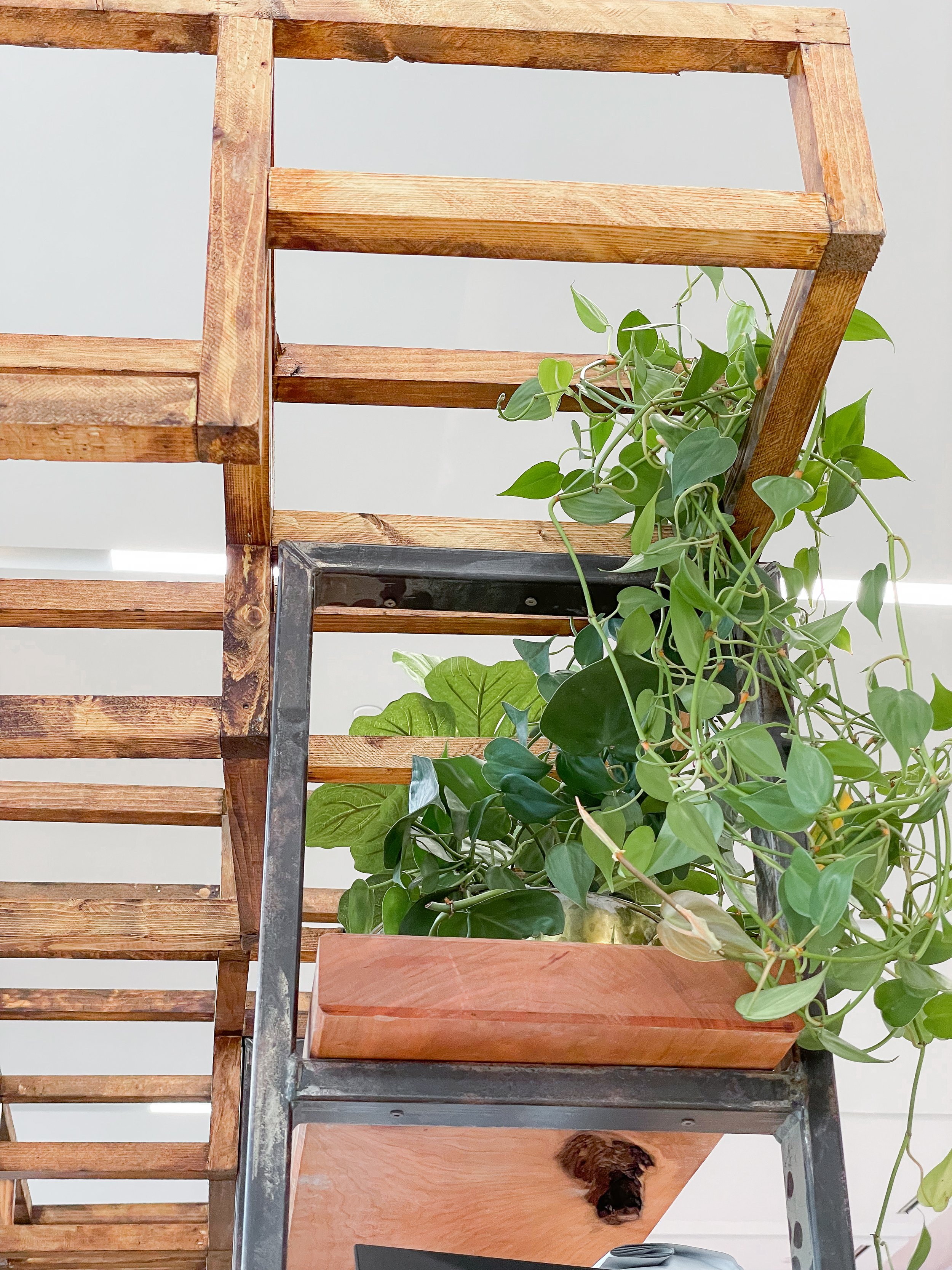
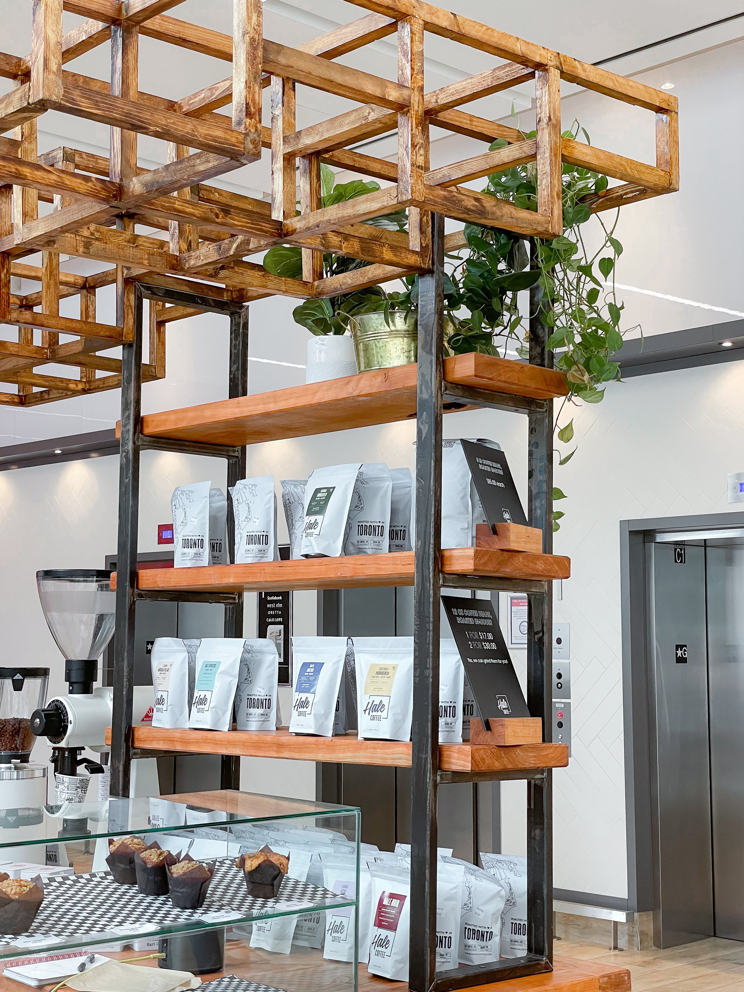
Knowing that sustainable materials and environmentally conscious design were important to our client, we went with a very natural and light-coloured palette—featuring raw woods like unstained red oak throughout the entire design.
Our goal was to make the kiosk both simple and clean, bringing in an earthy feel to complement their services and keep the main focus on fresh-brewed coffee.
The Concept
Keeping our approach as sustainable as possible, the concept for this cafe’s interior design was very earthy, natural, and reclaimed. We went the extra step whenever possible to create a minimal environmental impact—choosing to source local, reused materials instead of buying everything new.
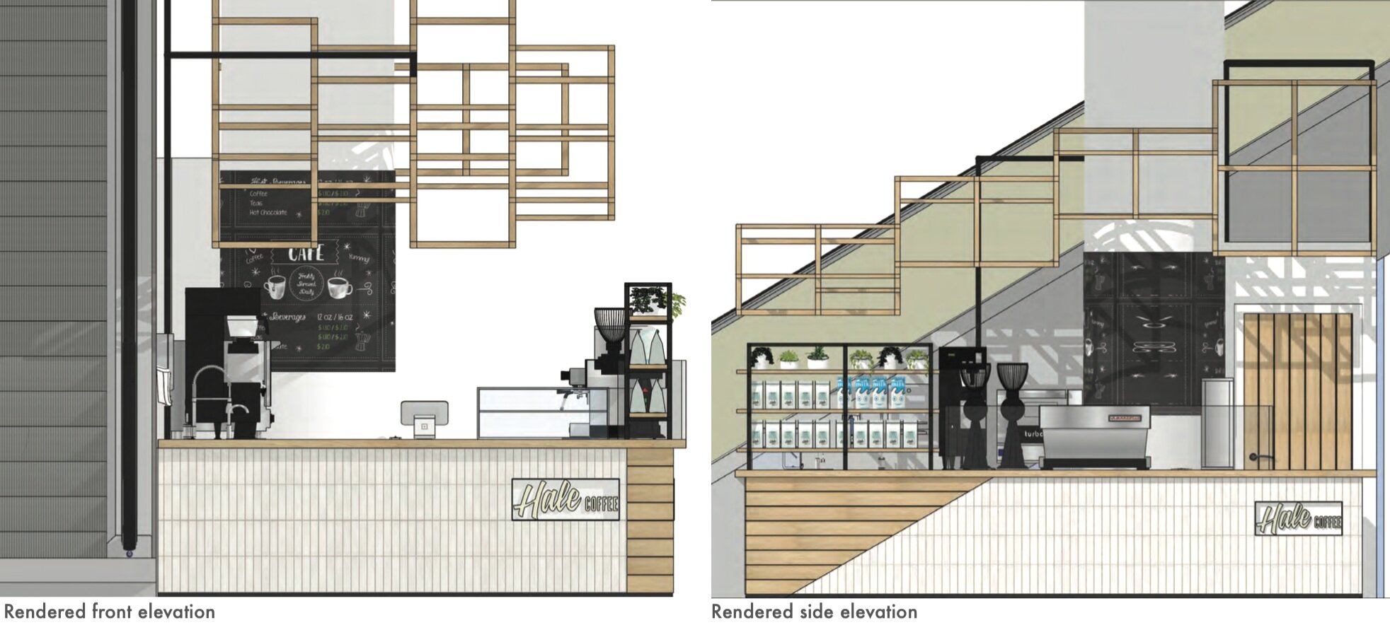
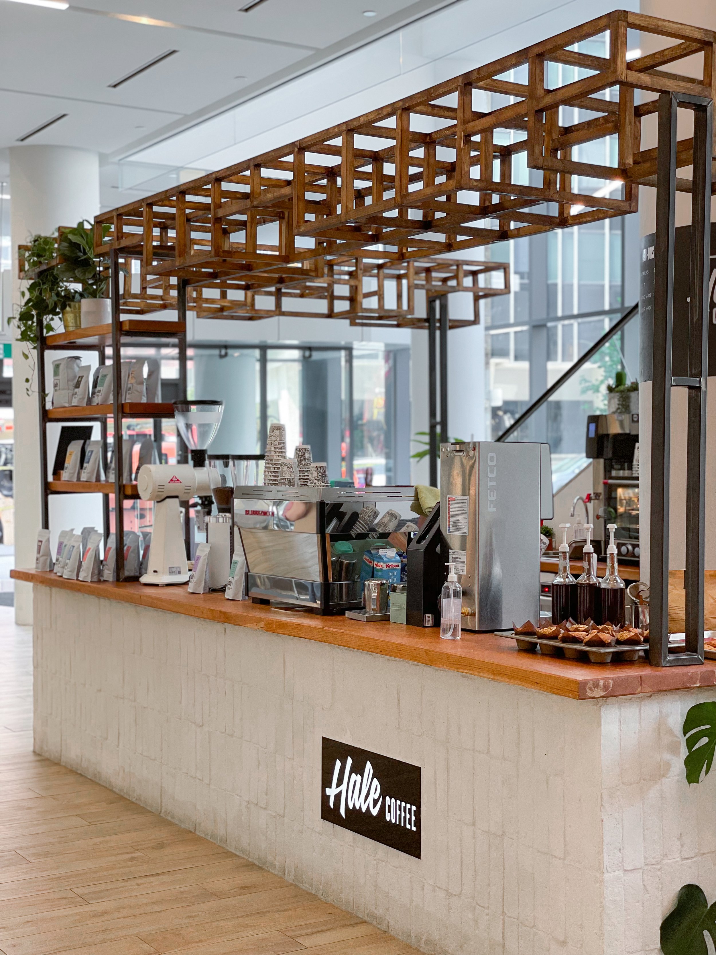
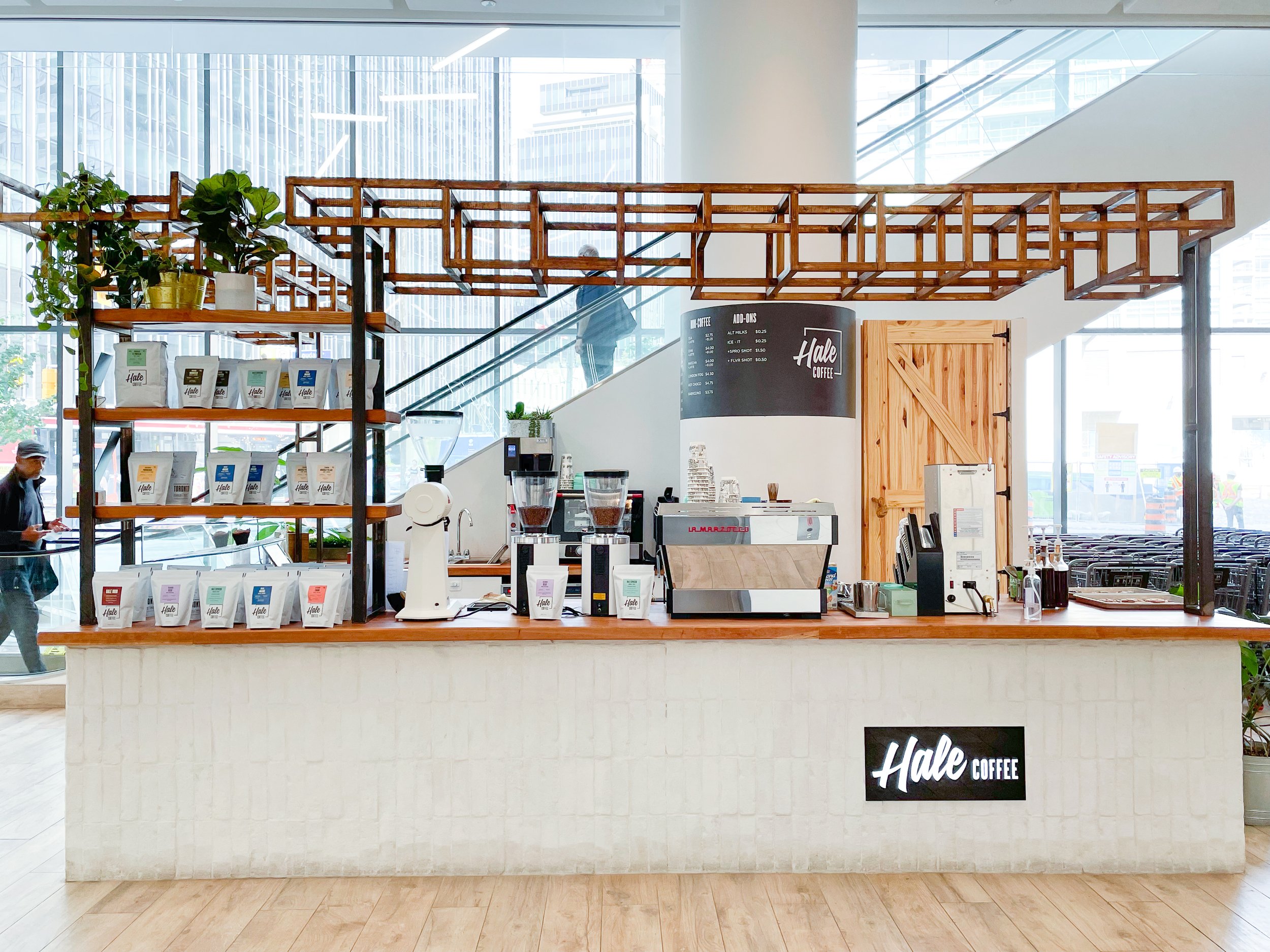
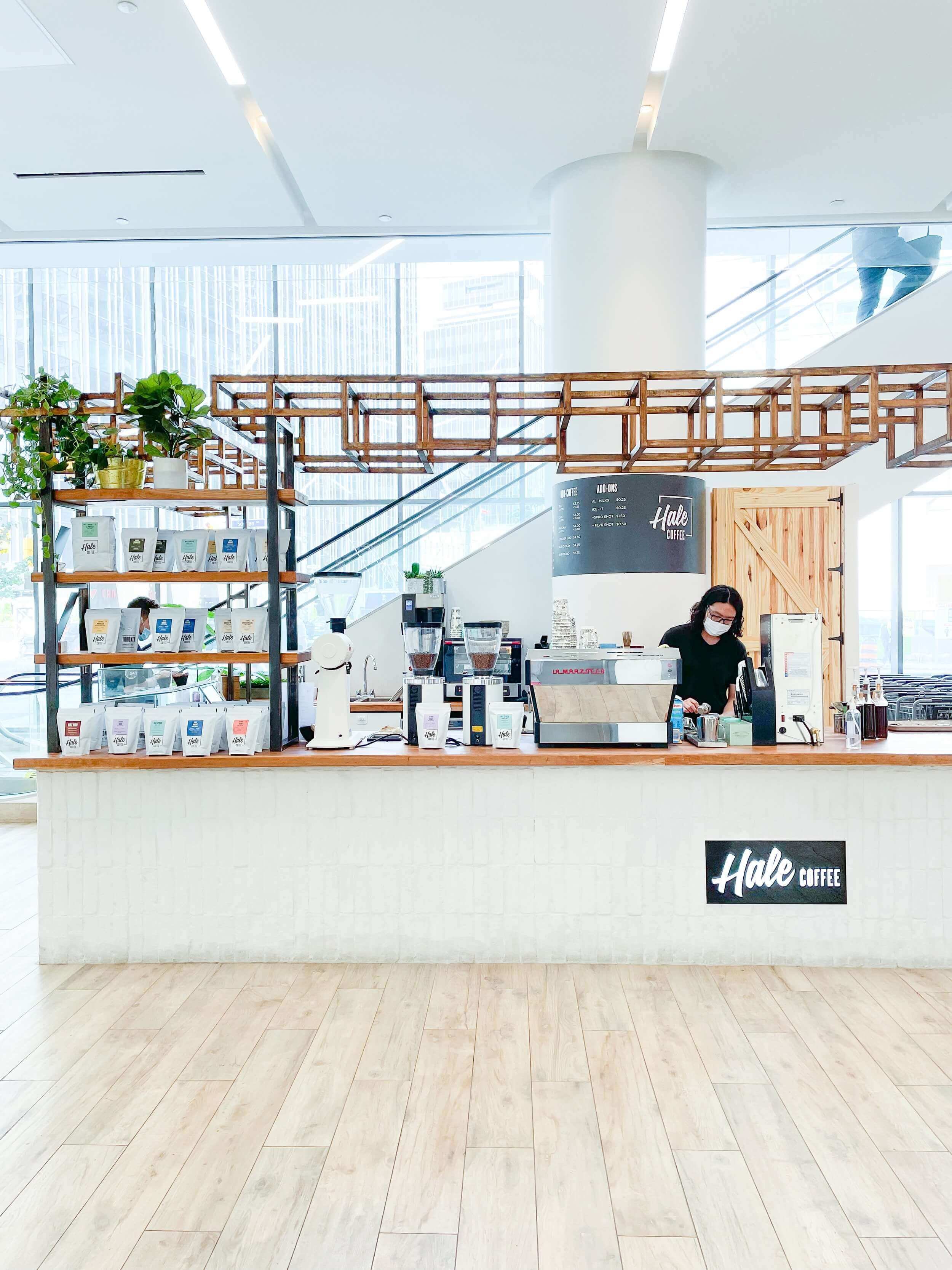
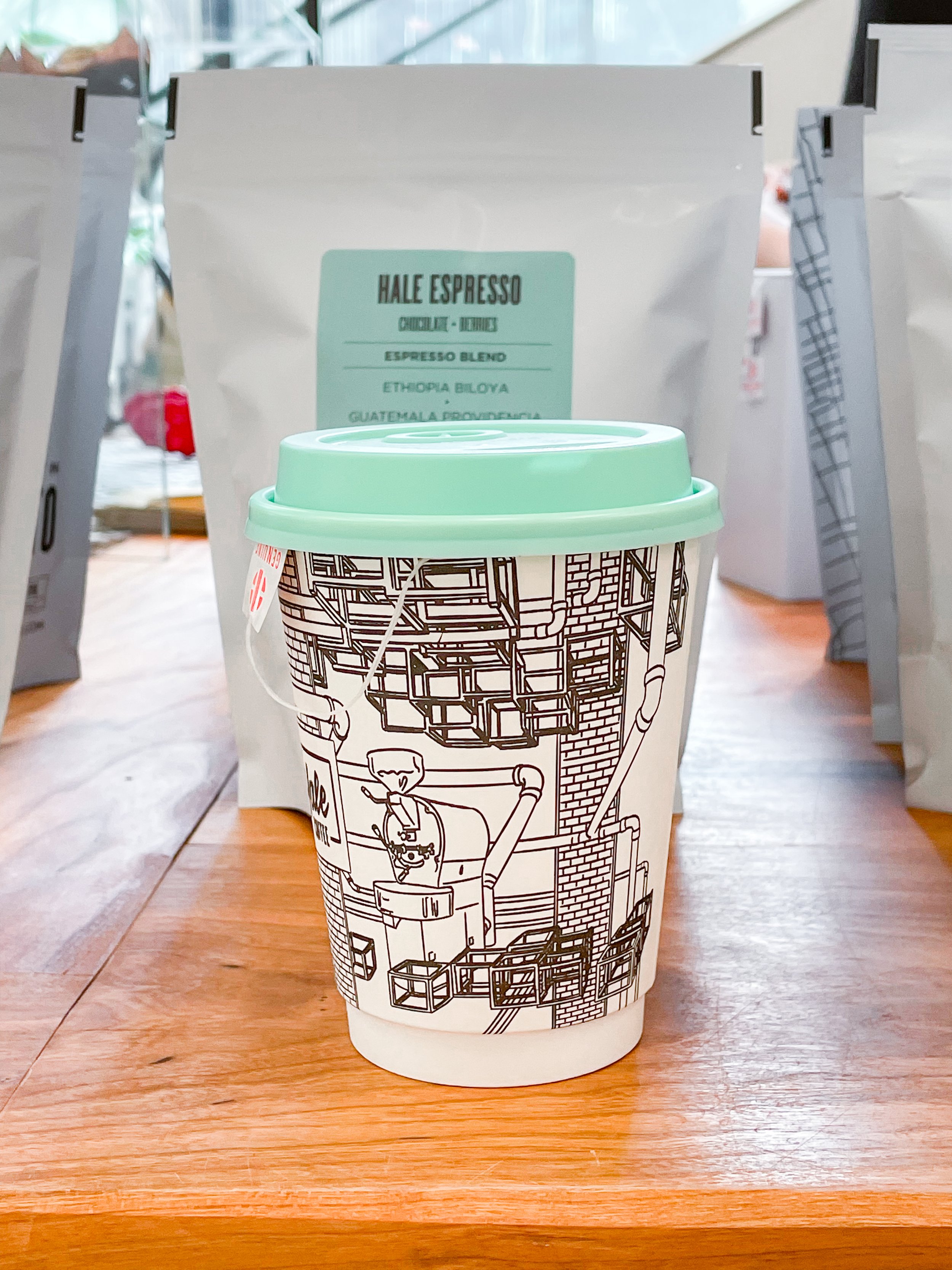
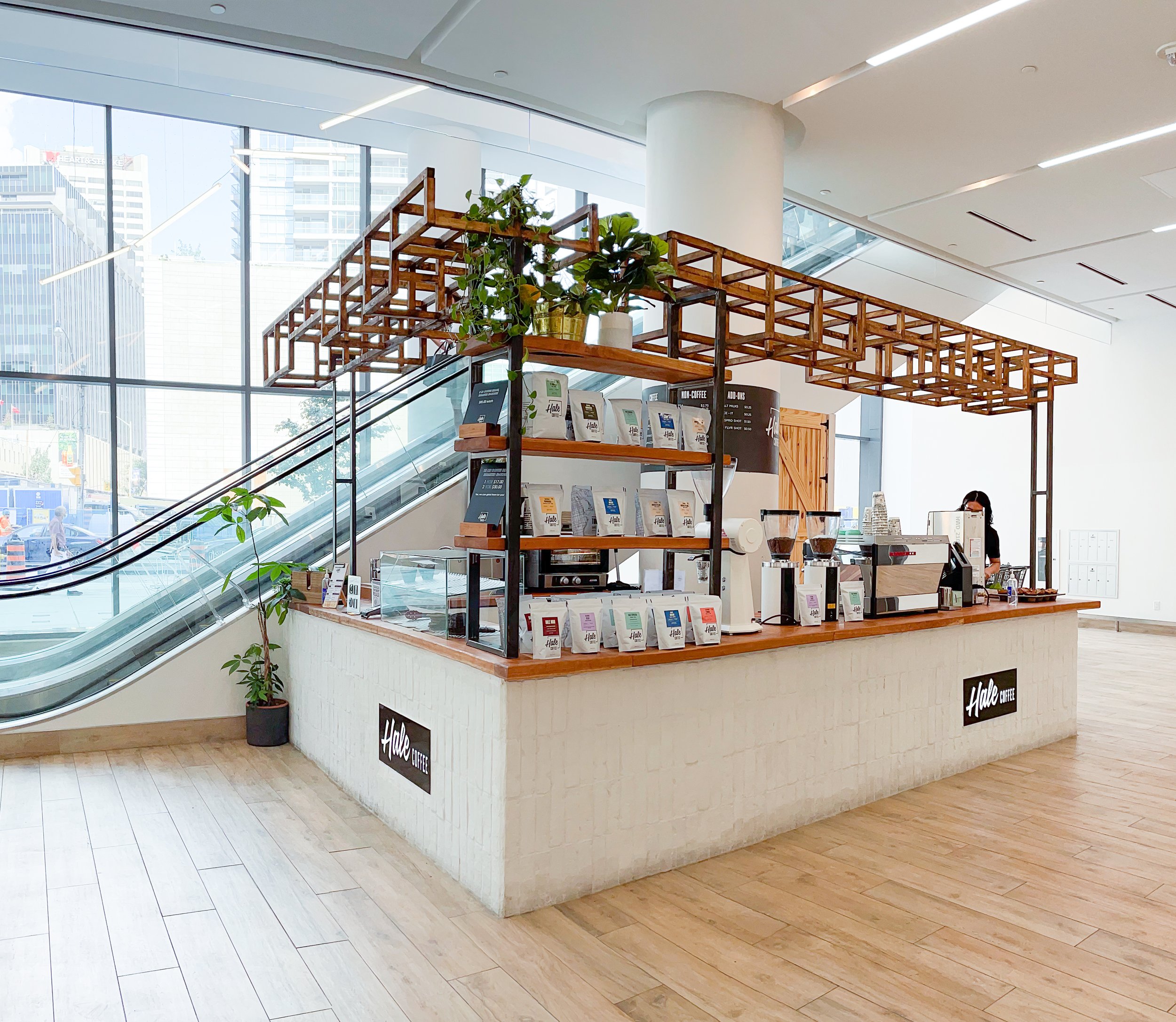
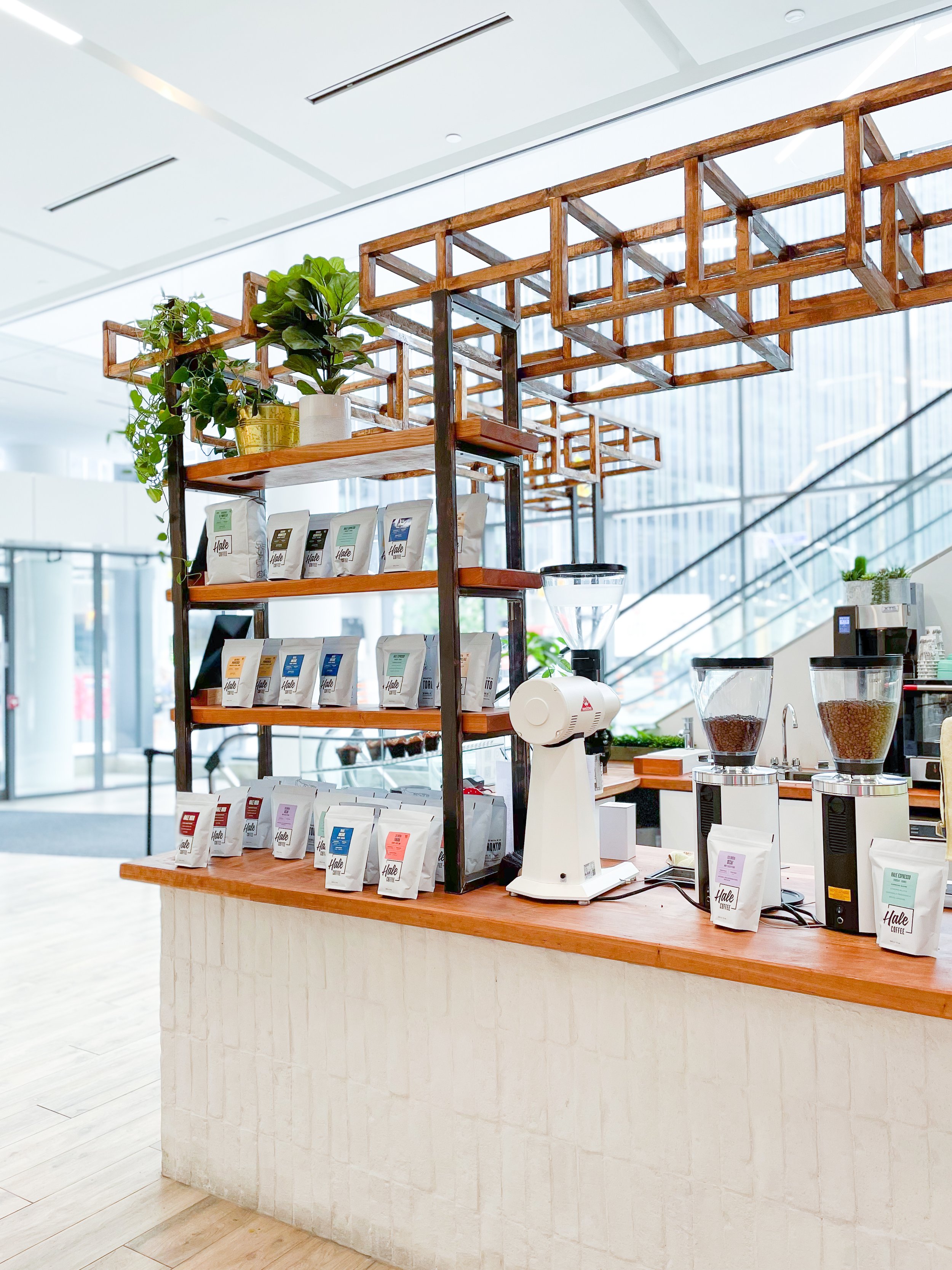
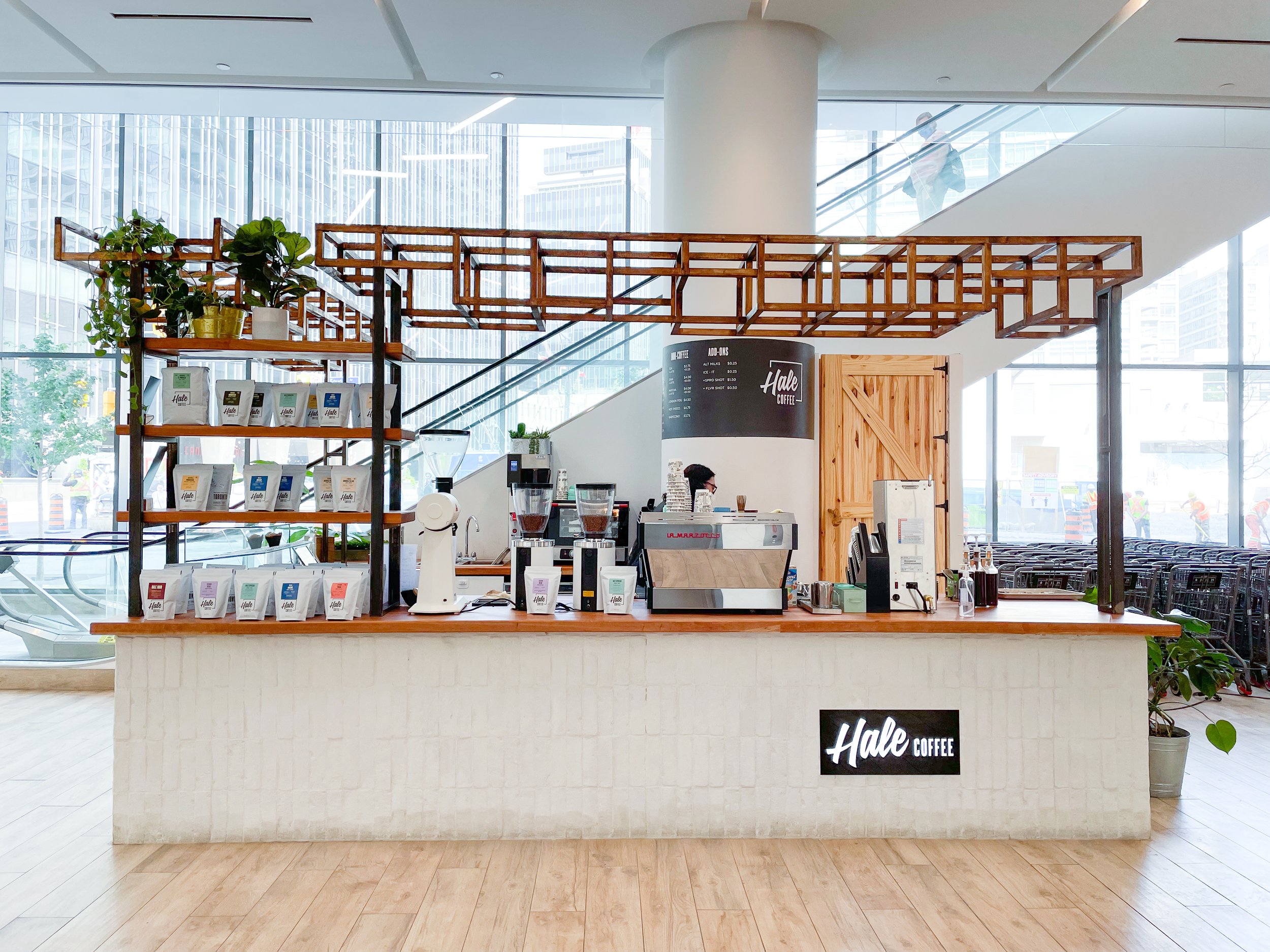
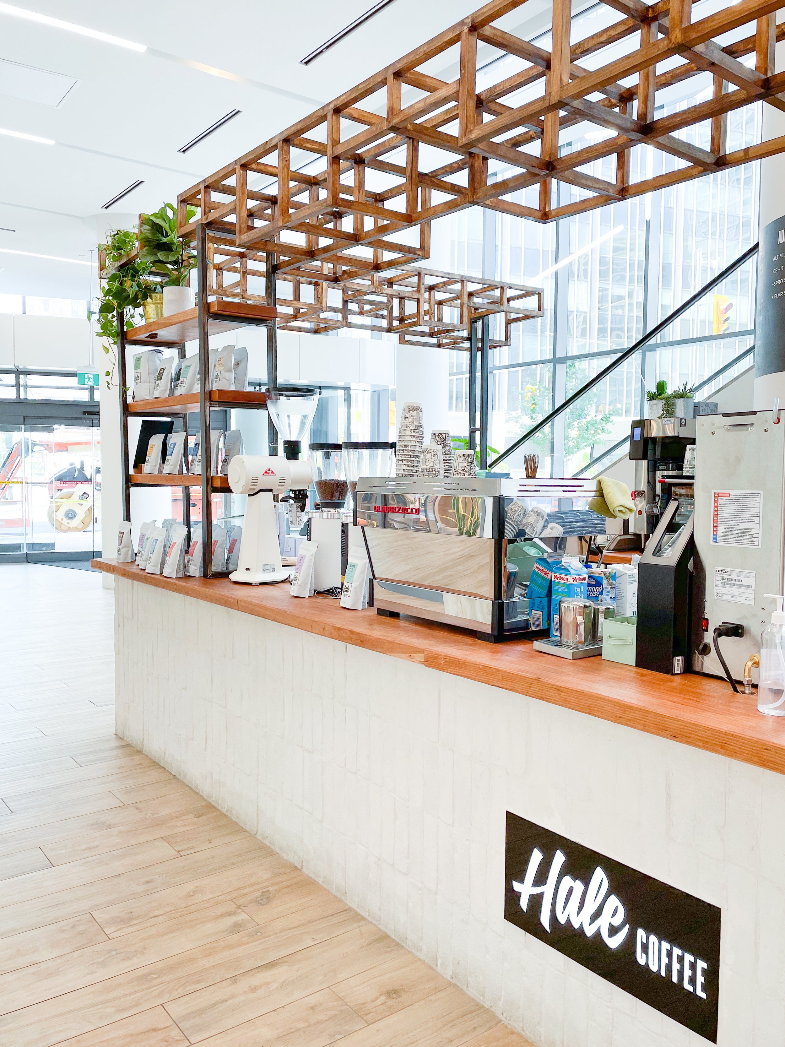
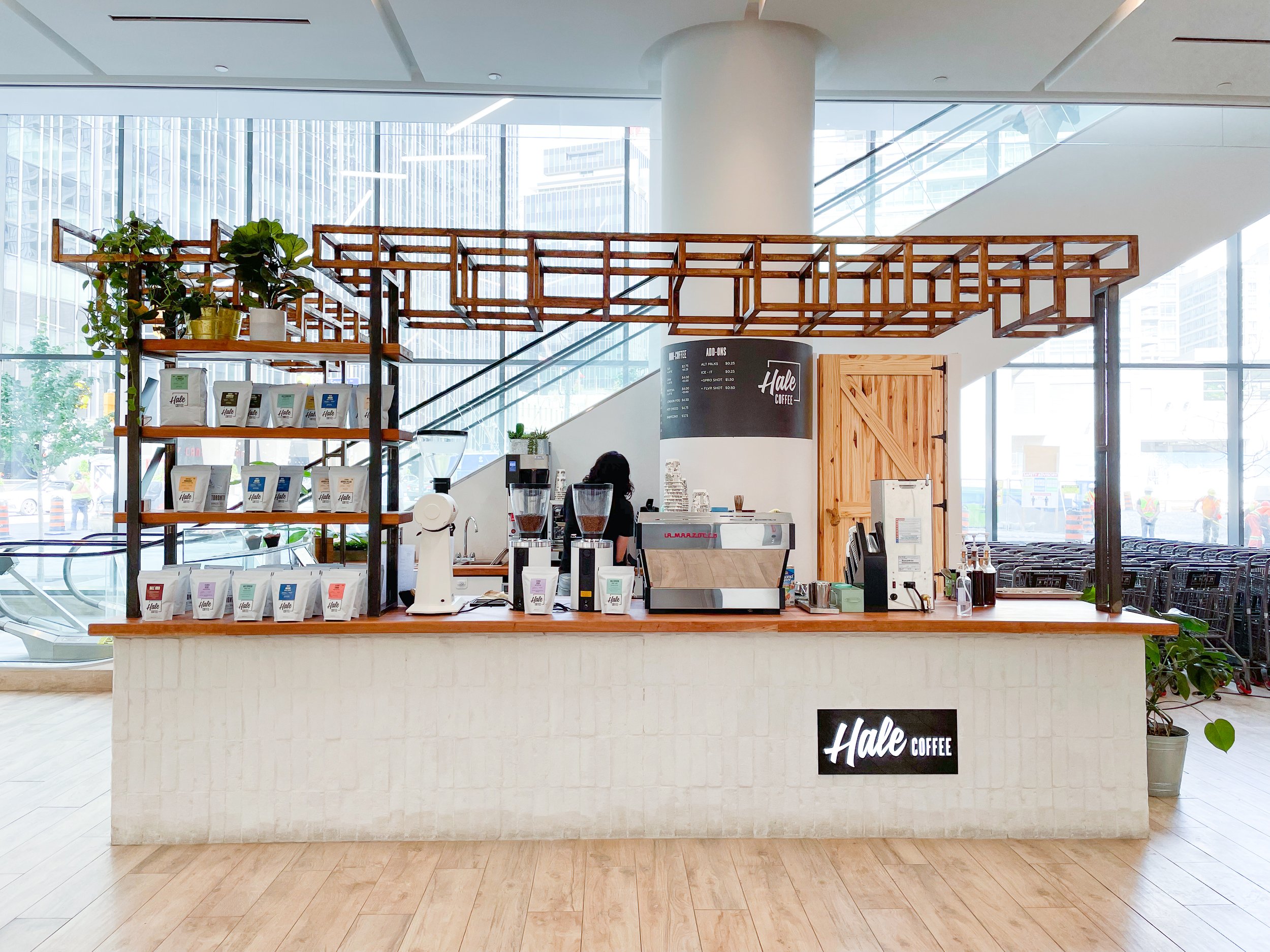
As coffee is the centrepiece of this brand, we thought it was important to showcase their espresso machine—creating a concept that made it the focus of the space. For the base of the counter, we sourced reclaimed brick salvaged from local demolished buildings, and we added in beautiful, modern shelving units to display the coffee and merchandise on top. It was important that this kiosk was both aesthetic and functional, with stunning front counters that also served as an easy, visual guide for customers to follow.
We needed to make this location more than just a kiosk, but an experience. Where the customer could walk in, smell the coffee brewing, and see the barista making their order fresh, before finally taking that first, hot sip.
The Blueprints
Even though it was a small kiosk, many steps needed to be taken before construction could begin. We still had to create a full construction set for the contractors to build from, and create additional sets for landlord approval. Multiple mood boards were made to accommodate both the client's wishes, as well as the various restrictions put in place. When creating this design, we had to closely follow the landlord criteria manual (which was quite restrictive in terms of what could be attached to the existing ceiling or to the flooring).
On top of that, we had to coordinate with mechanical, electrical, and plumbing to ensure we abided by the OBC (Ontario building code), while still having enough electrical and plumbing power to sustain all the kiosk's equipment. And finally, because this new location was housed in a large public building, the kiosk had to take fire safety protocols into account, as well as meet all accessibility standards and clearances.
With all these tight constraints, our design had to be really well-planned and use every bit of the small space we were provided.
The Build
When it finally came time to build, the process itself happened pretty quickly. The contractors had to frame the counter and run the electrical and plumbing—adding cabinets for storage and then the countertops.
These countertops (which the client fabricated himself inside his own woodshop!) were created prior to buildout, in order to get a head start on our timelines.
Although, we did encounter a big restriction when we discovered that we only had a limited amount of time during the day to operate the heavy equipment and machinery required to build the kiosk. We couldn't operate the tools we needed during peak shopping hours, as we had to be mindful of the other shops, shoppers, and mall operations.
Despite this, the actual buildout process still came together fast due to the many proactive measures we took beforehand.
Interior Design Renderings
The Final Results
Hale Coffee's third location was able to live up to the glowing reputation of their other shops—providing an easy, functional, and beautiful space for coffee lovers to frequent. Even though it's quite small, both the coffee and functional layout makes it prominent when you first walk through the doors. It is simple, clean, and straight to the point—with every square inch utilized to the max.
The design even attracted a lot of attention on its opening day, with people flocking to take pictures of the new kiosk—excited for the new cafe mid-town.
All of the small, thought-out details and larger interior design choices came together to create a cafe that could proudly continue the Hale Coffee brand. Our client was beyond satisfied with the final look, and we know their customers are satisfied too.
Keep an eye out for more Hale Coffees popping up! This is just the beginning for this local brand.
Now, excuse us while we go enjoy our cups of Hale Coffee!




Feeling Inspired?
If you're in Toronto and looking for a full café interior design, we'd love to collaborate.
Contact us and let our team of café interior designers support you.
Sansa Interiors Inc.
Toronto, Canada
info@sansainteriors.com
(647) 556-3137


