Roman Zaman
Restaurant Interior Design, Vaughan
A tailored restaurant experience that merges traditional middle eastern architecture with new world interior design.
Ahlan W Sahlan!
Roman Zaman is one of the GTA’s first halal Middle Eastern restaurants, focused on highlighting authentic Syrian House cuisine. The goal was to create a welcoming and ambient second location that perfectly captures Roman Zaman’s existing brand identity.
Our design approach was to present the Damascene values and traditions and bring them to life through inspired design, with an emphasis on the geometric patterns, brand colours, and typical Syrian architecture.
“Roman” in Arabic translates to pomegranate, which is the muse for this project. Damascene cuisine is recognized for its flavour and unique combinations, with pomegranate prevalent in almost all dishes. It was imperative to pay homage to both the Roman (pomegranate) and Zaman (the old days).
City: Vaughan
Property Size: 4,500 sf
Timeline: 12 Months
Budget: $800,000
The Design Approach
At Sansa Interiors we start by creating a distinctive design approach for each project, that aids us through the design process and sets the narrative we wish to convey through the space.
As this was our client’s second location, the foundational design concept and associated branding elements had already been established and utilized at their original Mississauga location by others.
Sansa was entrusted with the challenge of modernizing their interior design aesthetic to appeal to a new audience while simultaneously maintaining Roman Zaman’s core identity. Balancing these objectives allowed us to create a space that felt both familiar and revitalized, ensuring familiarity for returning customers, while enticing new customers to experience this second location in a fresh and engaging way.
The Concept
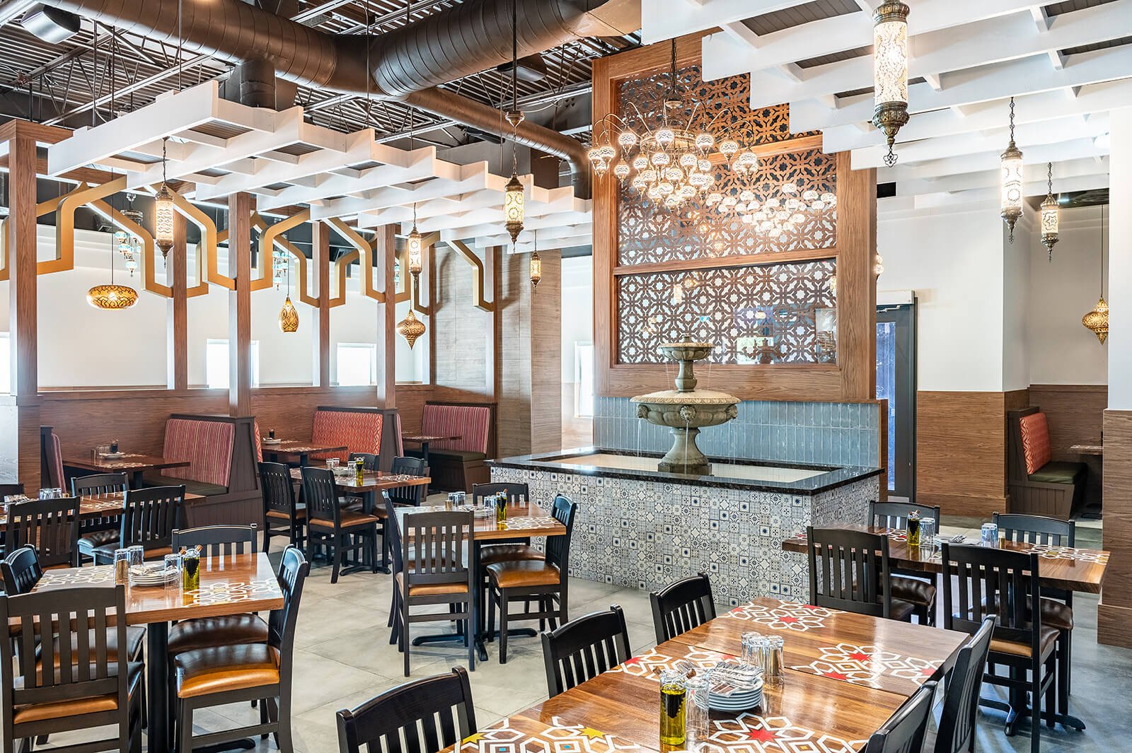
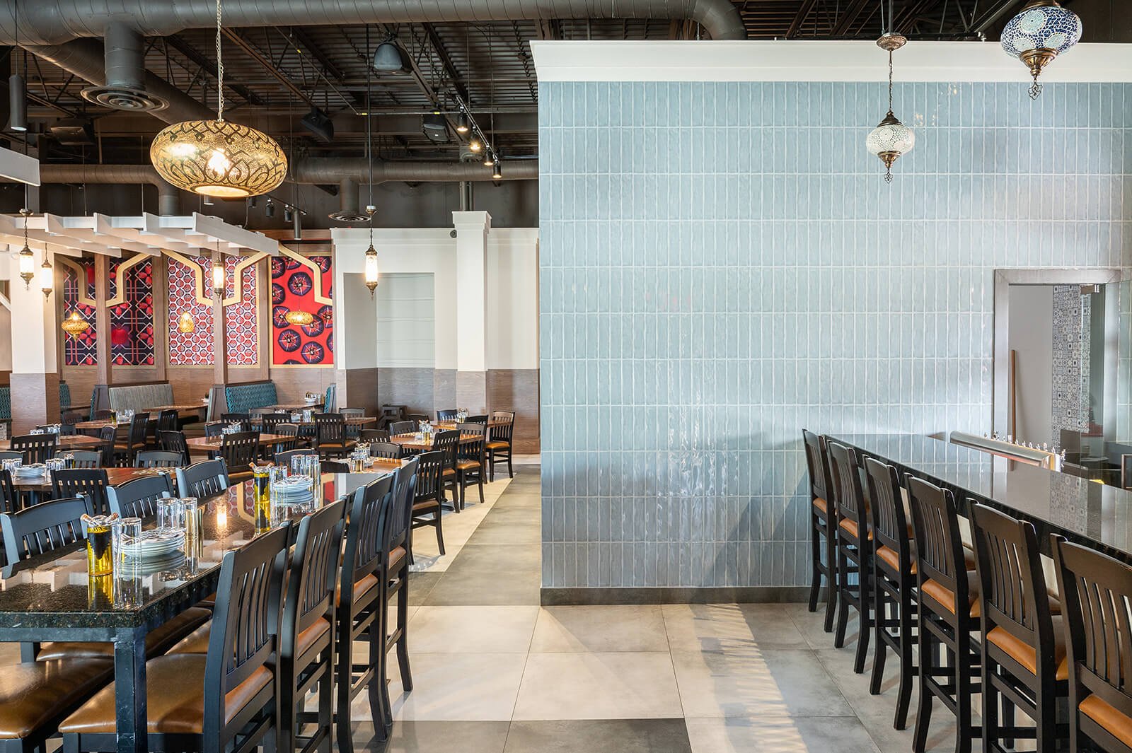
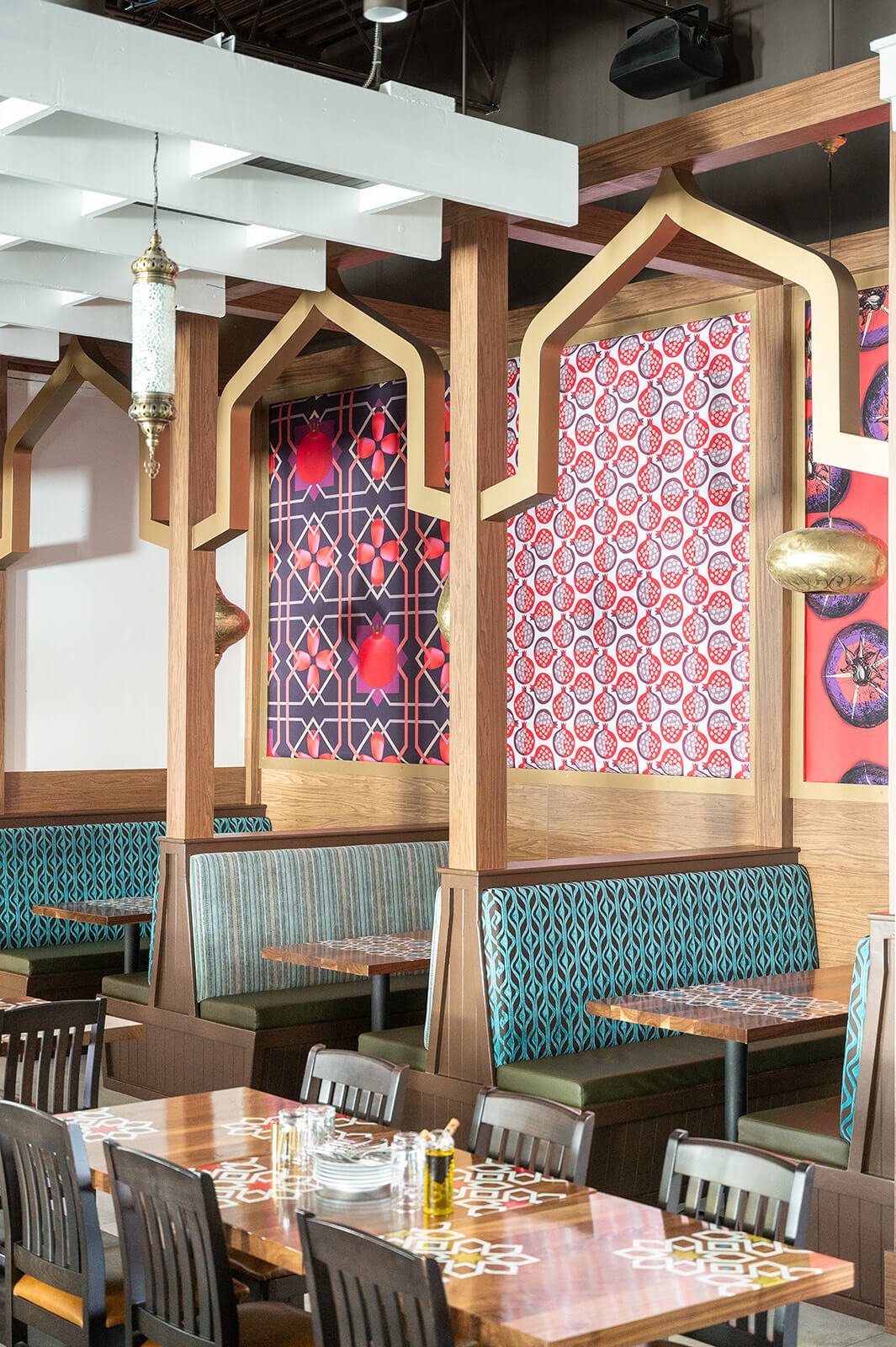
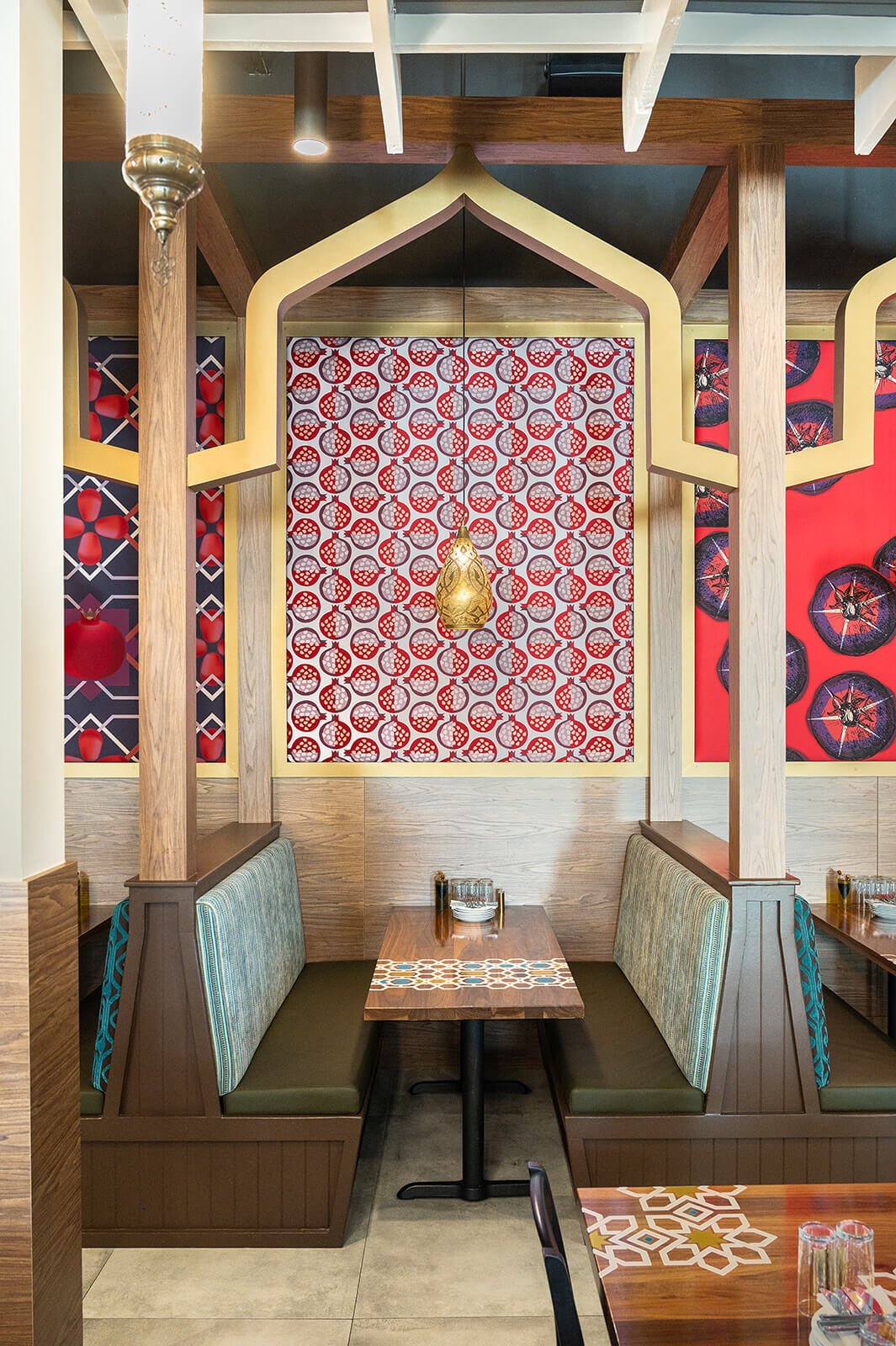
Colour theory has been thoughtfully employed throughout the restaurant to create an impactful, yet calming experience. A light and airy palette has been utilized to act as a subtle backdrop to the incredulous materials, finishes, and fixtures throughout. Bold patterns and colour offers contrast against the textural richness and warmth of wood and sleek metal. Abstract prints on the walls provide a direct link to the form and colour of the pomegranate, while a vinyl decal has been applied on tables to showcase beautiful copper silverware. A variety of antique lighting has been integrated throughout the restaurant that enhances the old world vintage charm with their playful light patterning and inviting glow. Each fixture was carefully selected and paired to compliment the space and tell a story that evokes a sense of nostalgia.
Before and After
From a bare space
To a layered and colourful restaurant
The Challenges
This project had unique challenges due to the fact that the client took over an existing location that had services connected from 1990.
1. Working with Existing Conditions
Working with existing conditions meant translating the created design elements within this space. It was our responsibility to conceptualize and present a working schematic layout that optimized efficiency and created vignettes and focal features within an already established space. It was a challenge that we predicted and planned for from initial stages of the design. A large existing fireplace wall to the right of the front entry had to remain so we transformed it into a waiting area for customers waiting for their tables.
The services were not sufficient (Power, Plumbing and HVAC) for the operations and the new equipment that Roman Zaman required so we had to work with the GC and engineers to balance all the loads and allocate equipment in a way that worked for the restaurant’s flow but also fit within local codes. We maintained and refinished the existing ceiling due to fire safety systems that were part of the base building structure.
2. Repurposing of Base Building Walls & Elements
The existing half walls and banquette seating locations were retained and refinished not only due to timeline and budget constraints; it made logical sense with our spatial plan.
Because we were working with a preconceived model, tight timelines (as well as budgets) are typically expected. It is perceived that the thinking has already been done and the fundamentals have already been established; that it is essentially a cut and paste project. Sometimes it takes more creative thinking to translate the design into a new space. As part of our design, we reused elements from the restaurant prior, such as the seating, knee walls, and millwork. These components were in good standing, and due to our construction timeline, it did not make sense to start from scratch. Refinishing the existing millwork and reupholstering the seating saved time in the schedule, as we did not have to factor in long lead times and the coordination of sourcing, fabricating, and delivering
3. Discontinuations
The length of time between the design of their first location and the second meant that some materials and fixtures had been discontinued and were no longer available. Sourcing these items had to be done quickly to compete with the tight timeline presented, while still resonating with the brand. The ability to think fast, adapt, and creatively problem solve is an attribute of a great interior designer. We worked with amazing suppliers to provide us with better finishes that are more suitable for a high traffic restaurant.
The Blueprints
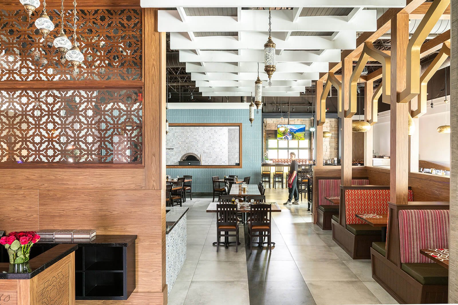
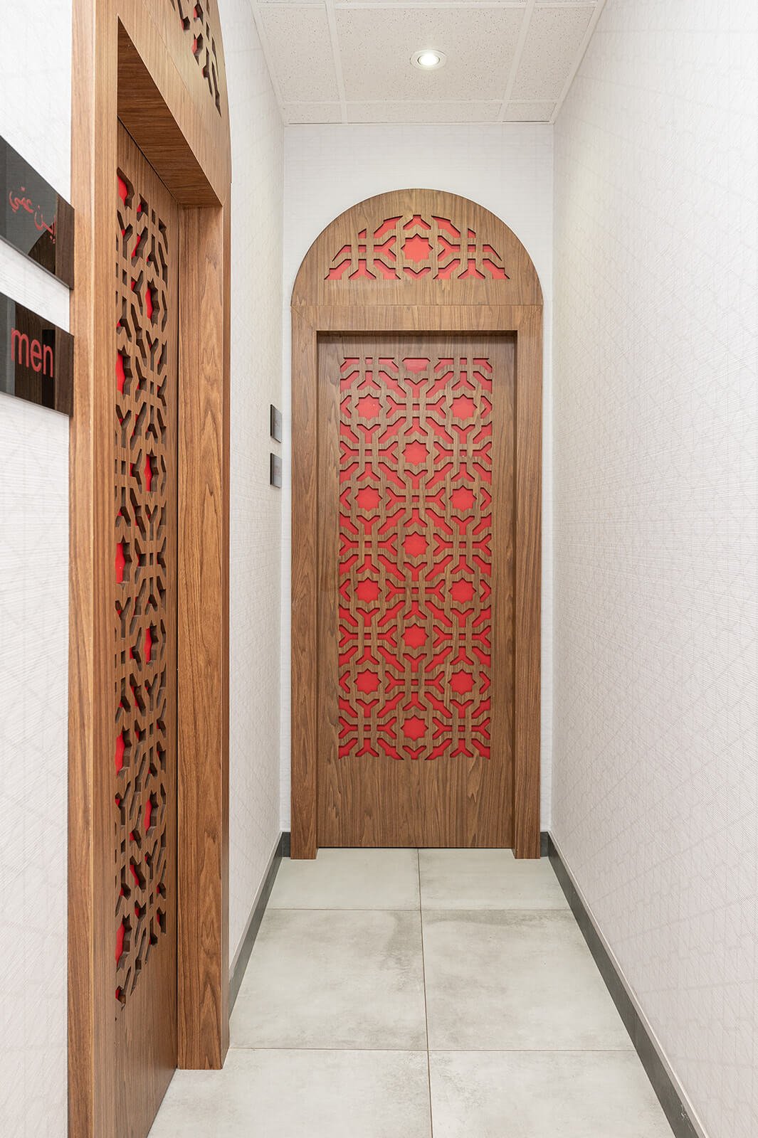
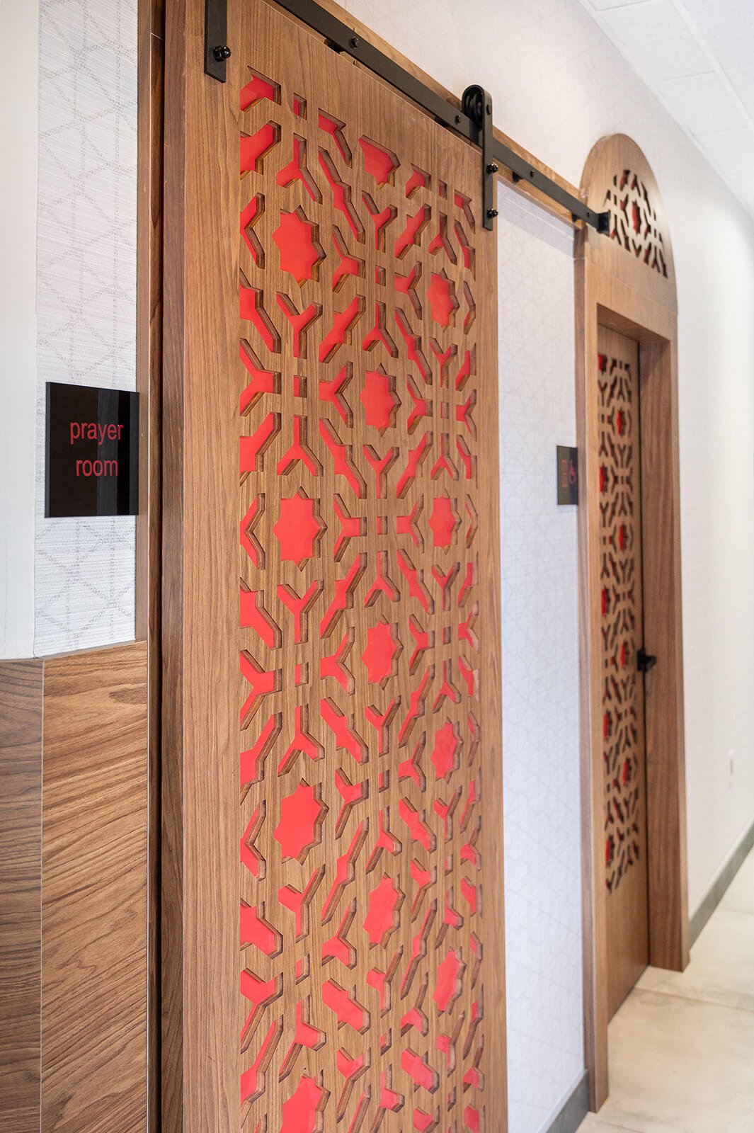
Highlighting Damascene design meant showcasing a multitude of different focal features to honour the history and heritage of this ancient civilization. An intricately designed ten foot custom cut panel featuring the Damascene star was installed front and centre on and behind the host stand, which immediately sets the tone for the vibe and aesthetic of the restaurant. The wood partition is sandwiched between glass panes, emulating a window that allows a glimpse to the antique chandelier behind, adding an extra element of visual interest via the light reflection.
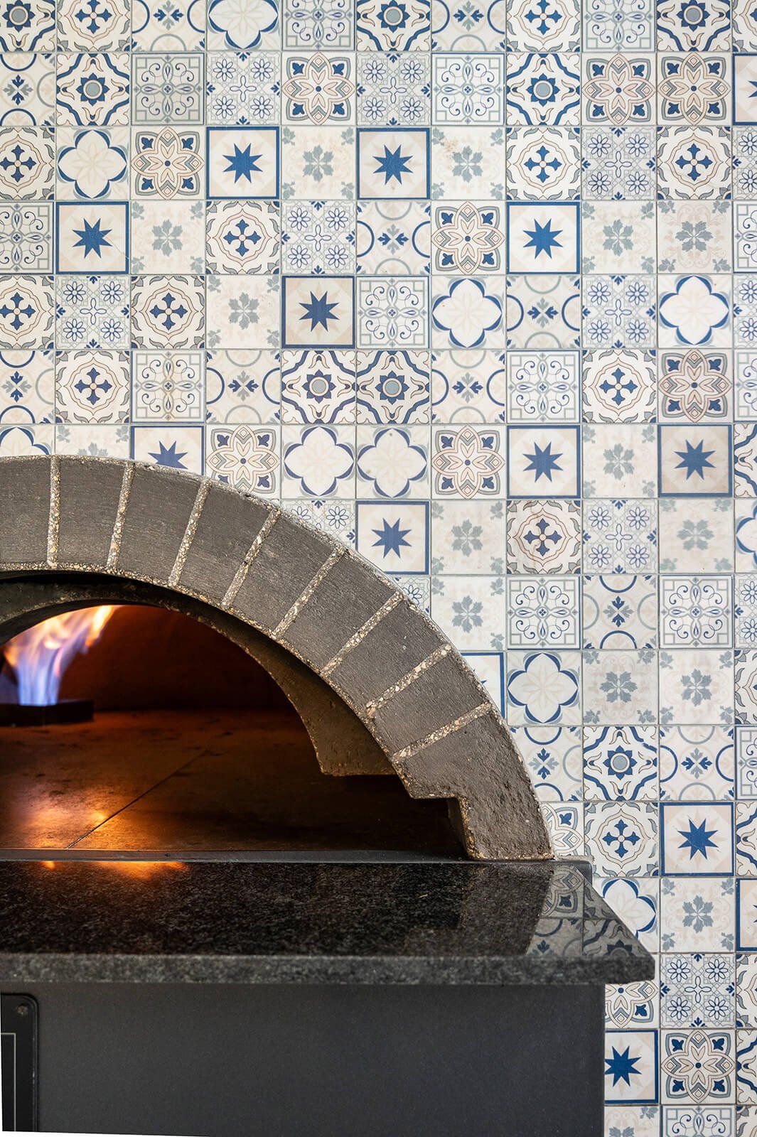
A beautiful stone water fountain has been installed immediately behind the partition that demonstrates an airy, courtyard-inspired experience through sight and sound, as the falling water creates a calming visual with white noise that supplants the sound of other conversations around you. The exterior facade of the fountain has been clad with a stunning handmade mosaic stone tile with a geometric pattern, and large format anti-slip tiles were sourced and installed to represent a modern approach to traditional tiles commonly found in a Syrian courtyard.
An expansive window at the back of house offers a vantage point to the open kitchen from anywhere in the restaurant, with a central stone oven that allows diners an alluring view to the bakery. The same handmade geometric wall tile employed on the fountain has been installed on the back wall of the bakery to create harmony, and brings a sense of continuity from the front of house to the back.
The Build
The spatial layout and flow of the restaurant were vital to its design success, as it was integral to showcase a variety of focal points and features. Upon entry, guests are greeted by a custom patterned partition that allows a tantalizing peek to the dining area beyond. The height of this panel draws the eye upward, guiding attention to the antique lighting and ceiling baffles, effortlessly leading your gaze towards the custom crafted millwork and pendant fixtures over each banquette.
Notably, the two most prominent features - the water fountain and open bakery - are strategically positioned as complimentary bookends to ensure that diners can enjoy a view of at least one of these captivating elements from any vantage point in the restaurant. A juice bar with seating was established to broaden the consumer demographic by offering fresh juices and quick bites as grab and go options. Bar height seating and tables were kept nearby, allowing diners who prefer a more casual experience to enjoy a vibrant atmosphere with good company and delicious food.
Retaining this area as a bar was both practical and rational, as an existing entry door provided the convenience of a secondary entrance for grab and go patrons, enabling access without navigating the entire restaurant. Existing half walls were preserved, as they provided a sensical layout for tables and seating that could be easily converted to private dining without compromising seating capacity in the main dining room. This approach created a versatile space that was flexible and could be easily adapted depending on the function.
The Final Results





Team of Consultants & Local Partners:
Toronto Interior Design: Sansa Interiors Inc.
MEP Engineering: HQ Engineering
Millwork: Canara Woodworking
Build: Pro As Contracting
Photography: Luke Cleland
client testimonial
“”
— Roman Zaman
Feeling Inspired?
If you're in Toronto or GTA and looking for a full restaurant interior design, we'd love to design it for you.
Contact us and let our team of interior designers support you.
Sansa Interiors Inc.
Toronto, Canada
info@sansainteriors.com
(647) 556-3137


