Bow Down to Mean Bao
Fast Food Restaurant, Toronto
A Case Study of Fast Food Restaurant Design in Toronto.
Mean Bao is a chain fast food restaurant in Toronto. Our goal for the Mean Bao fast food restaurant design was to create a compact-sized space that would streamline their takeout process and efficiently accommodate the restaurant’s grab-and-go system. In order to design for a restaurant that had a full takeout model, we had to include specific highlights like a takeout window and a large front counter to allow for a smoother customer experience. We set out to do this while also designing a space that would strengthen their brand identity.
City: Toronto
Property Size: 207 sf
Timeline: 4 Months
Budget: $150,000


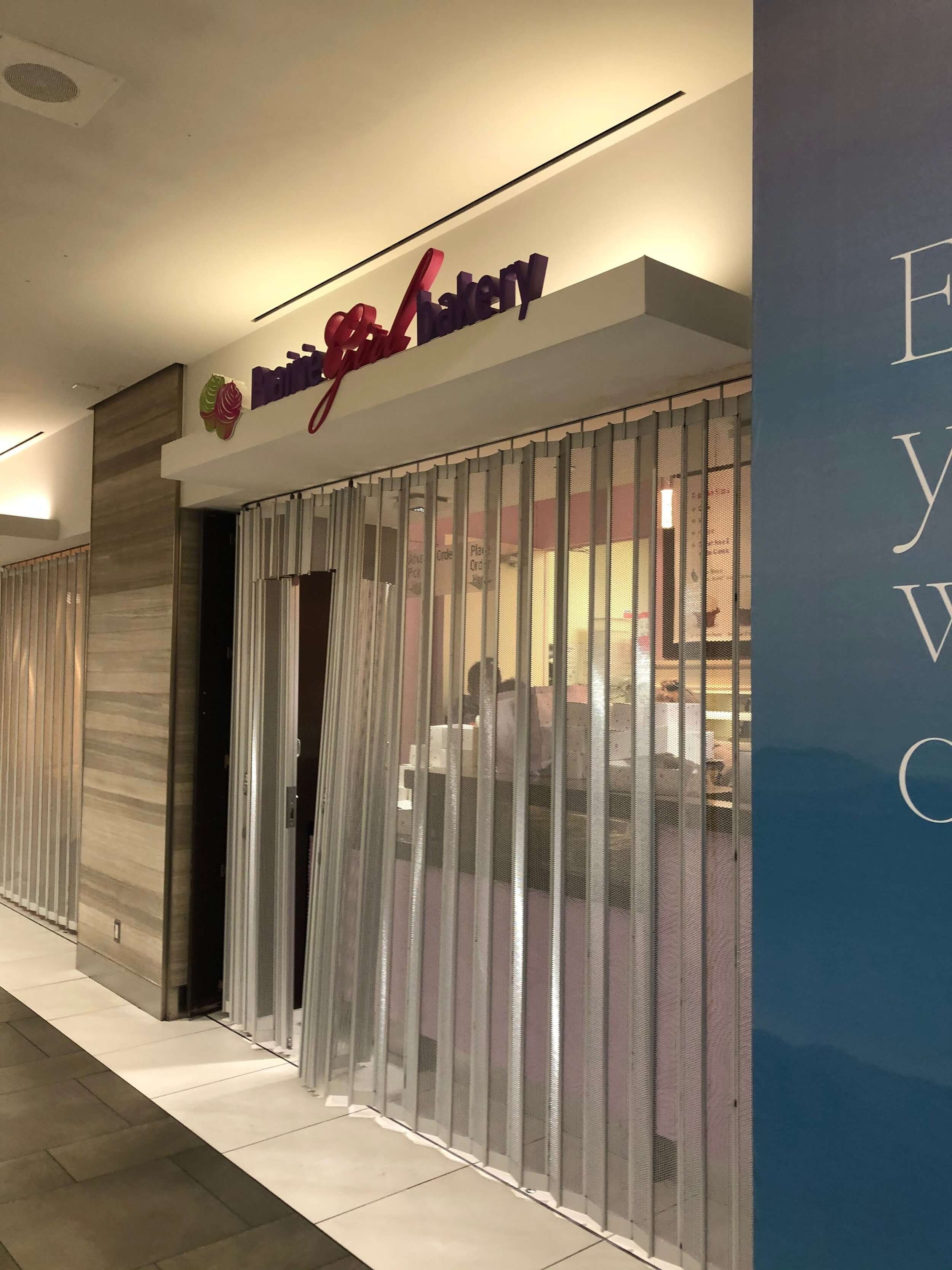
Before and After
From a dull, cluttered and tight space
To an airy, spacious, and colourful space
Brand Recognition for Fast Food Restaurants
The fast-food restaurant business is very competitive and so, for fast food restaurants, brand recognition is a key factor and in many cases, the brand is just as important as the food or service. Often in restaurant interior design, the design story doesn’t necessarily call for brand recognition. The focus is usually on creating an ambiance that amplifies the dining experience. This is completely different when it comes to fast food and chain restaurant design where creating a design that amplifies brand recognition is very important.
This is why chain fast food restaurants invest so much in their branding. This can be a challenge for smaller fast food restaurants as the fast-food restaurant industry is cluttered with large chain restaurants that have very recognizable brands. Fast food restaurant design in Toronto is particularly competitive because it is a large city with so many big-name fast food brands.
Operations
There were very unique factors to this project, one of which is that Mean Bao is a small fast food restaurant. This meant the design layout had to be a bit different from the typical fast food restaurant design layout. We made sure that the design actually improved the efficiency of operations. To do this, we set out to create an efficient and compact-sized space that would serve perfectly for takeout and grand and go system.
The Challenges
There are specific challenges that come with fast-food restaurant interior design and some of these challenges are specific to the city of Toronto.
We anticipated some of these challenges but, as a restaurant design company, we know that there will always be unexpected challenges when it comes to interior design for restaurants. In our industry, you should always expect the unexpected.
And so, we were prepared in advance to take on whatever obstacles that would emerge during this design project. We faced three main challenges, all of which we tackled with precision and professionalism.
Covid-19 Lockdowns
A major challenge we faced during this project was the 2020 Covid-19 lockdown restriction in Toronto, Ontario. Due to these lockdown restrictions, we faced a lot of delays. The project was delayed for 8 weeks in total as we had to “pause” construction several times in accordance with the lockdown laws of the city of Toronto.
When it comes to fast food restaurant design in Toronto, there are many rules that we have to follow to meet the requirements of the city. Covid 19 pandemic only made the list longer.
The Covid-19 pandemic was a very serious issue and so we understood the gravity of the situation and obeyed all the lockdown requirements. It might have slowed us down but it was for the betterment of the community and for the greater good.
Limited Operation Hours + Slow Approval Process
Mean Bao is located in the First Canadian Place building which is in the financial district of Toronto, Ontario. Since the restaurant is located along a busy corridor, the building gave us limited hours of construction each day. Because of this, our team had a very short window each day to use heavy machinery or receive deliverables for the job site. The building management also had to approve all deliveries ahead of time. Their approval process was slow and coupled with the limited operation window, it was quite a challenge.
Though these complicated things for us, we rose to the challenge. We navigated the situation with precision to make sure we maximized our time. We also coordinated with the building management to ensure that all our deliveries were approved sufficiently ahead of time
Logistics Nightmare
Since First Canadian Place is located in downtown Toronto, it was a challenge finding parking around this location. In addition, Mean Bao is located deep in the building and so it is a long trek from the restaurant location to the nearest parking lot. This trek was tedious as we had to move materials and workers to and from the construction site.
However, this didn’t deter us or curb our enthusiasm for the project. We were able to quickly get into a rhythm and system for transporting materials from the parking areas to the location in a timely manner.
The Design Approach
Our design approach for Mean Bao was to create a modern fast food restaurant interior design that accommodates smooth operations and also had a stand-out and eye-grabbing design. To do this we had to integrate restaurant architecture with design psychology. There are several factors that differentiate interior designers for restaurants from other types of interior designers. One of which is taking into account the psychology of the design elements in the design approach. We expanded on this in our blog post The Psychology of Restaurant Interior Design.
The Concept
In spite of the tough competition in the fast food industry, we know that customers appreciate the value of smaller fast-food restaurants like our client Mean Bao. Mean Bao provides unique and authentic fast food. So our design concept was to create a space that reflects our client’s uniqueness. There is beauty in the “small” when it comes to restaurants. So we played up these advantages and designed a restaurant that stands out in a unique and memorable way but also sticks to the chain restaurant renovation requirements.
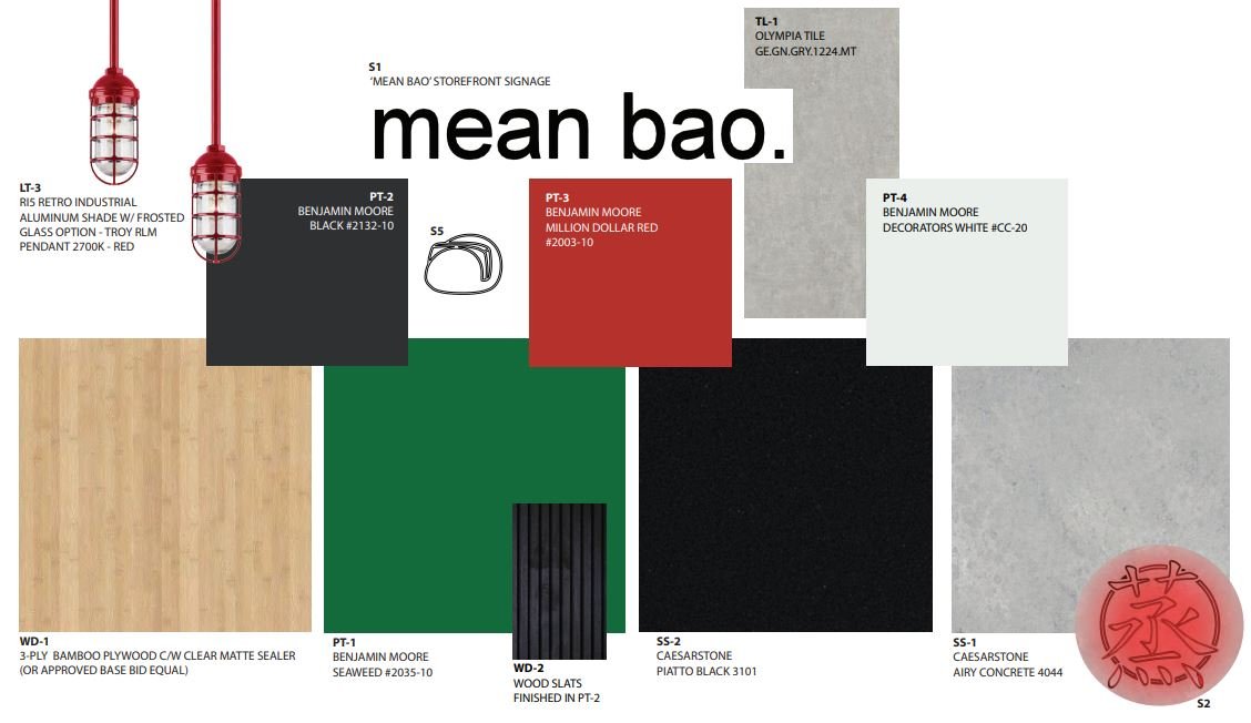
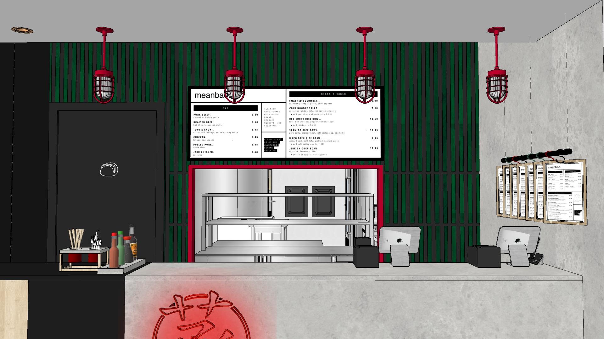
The main design elements included seamlessly blending bold colors with Chinese characters and icons to celebrate the Chinese origins of Mean Bao’s food offerings of Dim Sum-inspired snacks. We built a slatted back wall in black and green colors that also featured traditional bamboo wood. We paired these colors (green and black) with the traditional bamboo wood to create a seamless transition and a cohesive feel. We gave the countertop front wall a rough earthy concrete surface which served as the perfect backdrop to complement one of our standout design elements- the bright red neon sign
This speakeasy design offers a clean and playful spin on traditional Chinese design thus creating a space that’s full of color, character, and intrigue.
The Blueprints
Given the scope of work and location of the project, we had to follow specific guidelines for the architectural blueprints, renderings, material, and signage. Since Mean Bao is located inside the First Canadian place, we had to submit our blueprint for approval before the project could begin.
The total budget for this project was $150K and we made sure every dollar was put to good use. To bring this fast food restaurant design to life, we
included unique elements in both the structure and the design that would differentiate our client’s restaurant from other chain restaurant designs. Since this was a small fast food restaurant design, we made sure to create a blueprint that would encourage a personal connection and familiarity between the restaurant and its customers.
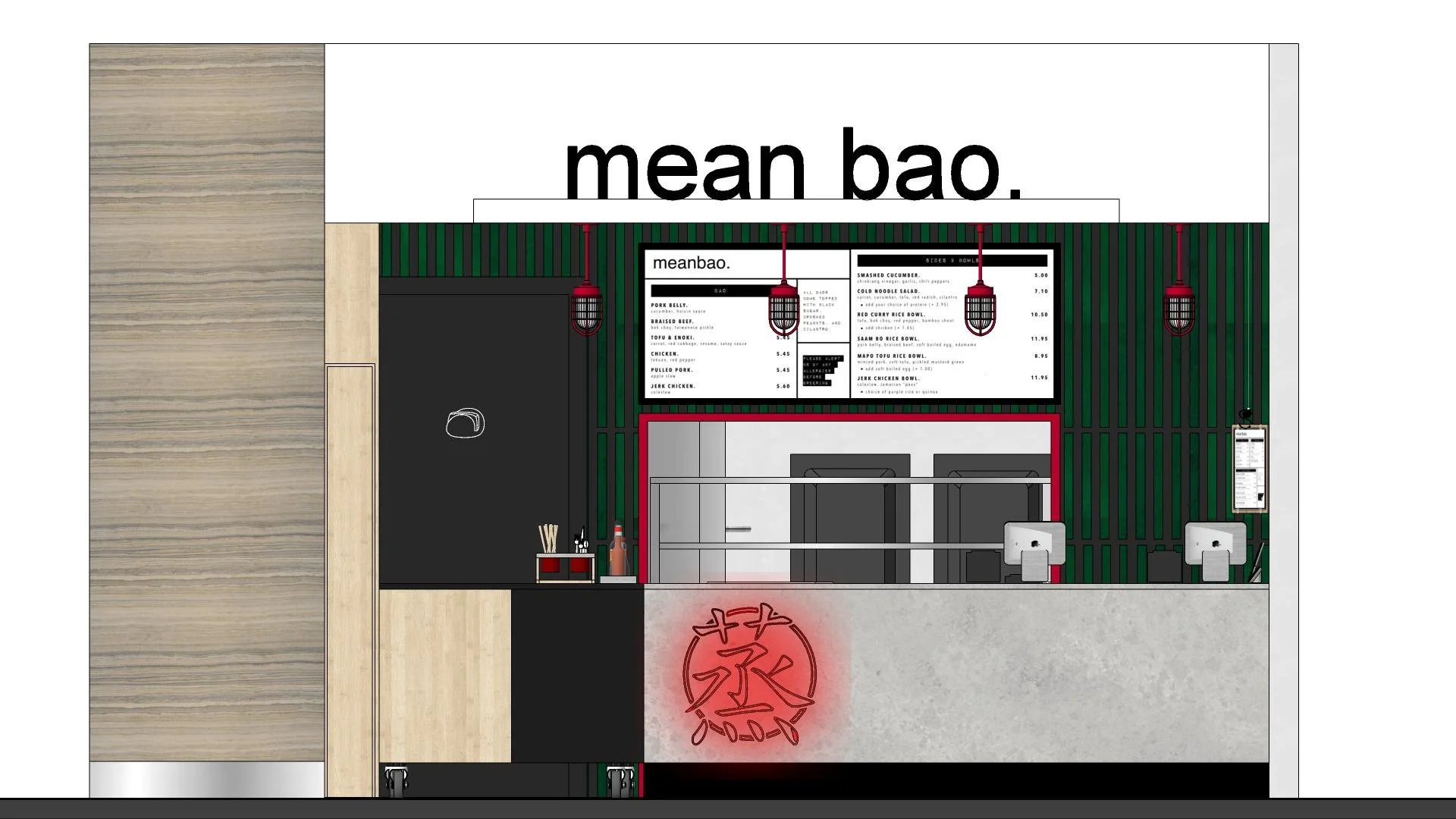
To bring this concept to life, we built a back wall that was a focal point for the front of the restaurant. The wall was also the backdrop for the restaurant menu lightbox enclosed in a matte black metal frame. The menu was installed symmetrically in the middle and slightly above eye level. Below the menu lightbox and also inserted into the back wall was a large window to ease the flow of things in this takeout-only restaurant. With this window, back workers can easily receive and deliver orders in a seamless manner.
Attached to the countertop wall was a swing door made of wood and painted black and brown. Right above the storefront was the Mean Bao store sign which is black in color and in 3D form. We went for this rough concrete surface for the front counter wall to add texture to the space and give it character.
The Build
It was very important to build a space that had a catchy and eye-grabbing look as Mean Bao is located in a busy hallway. We wanted the restaurant front to grab the attention of commuters and workers while also maintaining a sophisticated aesthetic. We did this by adding soft-touch yet memorable accents like the pendant lighting with a red accent that complemented the neon Mandarin sign.
We built the front space of the restaurant— where food orders are taken, to work seamlessly with the kitchen at the back of the restaurant— where orders are prepared. Since this is a takeout-only restaurant, it was very important that the build and layout supported a seamless operation from start to finish.
We made sure the pass-through window was functional and big enough while also complementing the overall design of the space. The window is a focal point for a small restaurant like Mean Bao and is plays of double role of being a necessity for operations and also a design element.
Another design element that was also one of our favorites was the suspended clipboard menus on the sidewall. This seemingly small design element is very integral to the functionality and flow of a a takeout-only restaurant fast food restaurant.
Interior Design Renderings
The Final Results
The final look was a perfect representation of a modern fast food restaurant design. The design and layout improved the efficiency of operations for Mean Bao. In this completely renovated space, the kitchen area now had more space and a light and breezy feel. The front area was more stylish and very noticeable and it had an overall seamless look.
Feeling Inspired?
If you're in Toronto and looking for a full commercial interior design, we'd love to collaborate.
Contact us and let our team of interior designers support you.
Sansa Interiors Inc.
Toronto, Canada
info@sansainteriors.com
(647) 556-3137


